
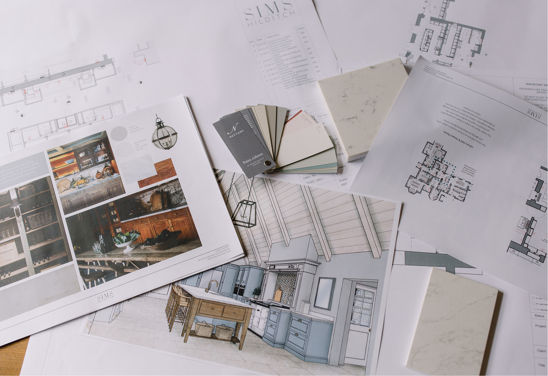
Every designer has faced a moment of colour paralysis at some point in their career. Paint charts strewn across the table, fabric samples piled high, 17 shades of white swatched side by side on the wall, a cold sweat breaking as you realise not a single one feels quite right.
Why does choosing a paint colour sometimes feel so impossible? It’s not a matter of taste. It often comes down to feeling like you have to make the perfect choice, for yourself or a client, and not having clear guidelines to help you make that decision with confidence.
As Nina Campbell says,‘Colour has to be one of the most important questions — and of course colour is really personal, because there are colours that one person loves and another person can't even imagine using.’
Thankfully, choosing the right paint colour is a skill, and once you understand a few key principles and put in a little bit of practice, those moments of decision paralysis start to fade.
Here’s how expert designers tackle their paint decisions.
Where to start when choosing a paint colour
Most people go straight to the paint charts, but experienced designers ask a few key questions before they even look at swatches.
- How will this room be used?
- When will this room be used the most? ( Daytime? Evening? Only on special occasions?)
- Who will use this room?
- What kind of light does this room get?
- How do I, or my client, want to feel in this room? ( Relaxed? Engergised? Cosy?)
- What fixed elements already exist? ( Flooring, joinery, furniture that must stay)
Choosing colours becomes much easier when you keep these questions, and your answers, firmly in mind. As Edward Bulmer frames it, ‘For the interior designer, scheming is always the fun bit, but for many people it's actually quite daunting. And that's why I think you have to give yourself these aids, these stepping stones.’
Having constraints in place, like knowing that your east-facing living room is where you want to unwind and feel relaxed in the evenings, and that you cannot change the colour of the floors or chimneypiece, is a much stronger starting place than going straight for the paint chart.
Considering light when choosing paint colours
Never underestimate the power of light, especially when it comes to colour. Understanding how much light a room gets, the quality and character of that light, and how it shifts throughout the day, can dramatically change how a colour looks and feels.
South-Facing Rooms:
These rooms receive the most daylight throughout the day, which is very forgiving when it comes to colour. It means most colours will work, and mid-toned colours will feel bright and lifted. But be careful, it can also wash out pale shades entirely.
North-Facing Rooms:
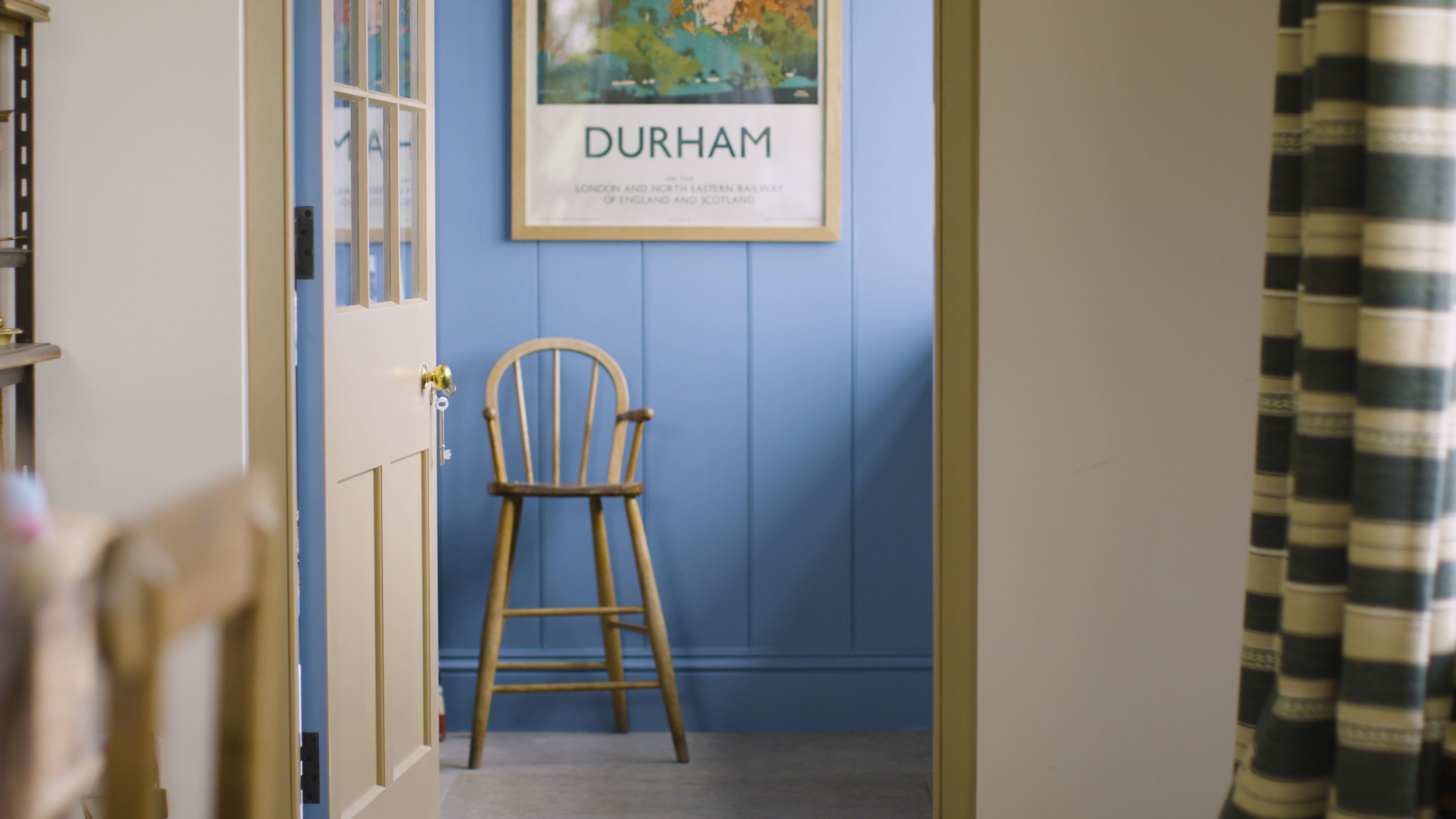
Rooms that face north will get very little natural light throughout the day. These spaces tend to be cool and flat, and colours that looked effortlessly elegant in the shop can now read cold and dingy. However, this is also a great opportunity to play with saturated colours. Mid-tones and deep-tones tend to work well in these spaces.
East-Facing Rooms:
These rooms are at their best in the mornings when they’re bathed in a bright, cool sunshine that gradually fades throughout the day. By evening, these spaces can feel noticeably dim, so it’s important to find a colour that can shift with the light. Warm-toned colours, such as terracottas, soft ochres, or warm whites, can help counteract the cooler afternoon light.
West-Facing Rooms:
These rooms come into their own in the afternoon and evening when they’re flooded with a warm, golden light. In the morning, however, they can read as flat and a little grey. Colours with warm or neutral undertones tend to work best in these spaces as they can hold their own in the cooler morning light and sing when the evening sun arrives.
It’s not just natural light you need to take into consideration; artificial lights will also play a key role in how a colour responds. Will you mostly use warm lamps? Bright spotlights to illuminate workspaces? A mixture of both?
The same colour can behave very differently depending on the lighting conditions. As Kate Watson-Smyth describes it, ‘You might find you have what you thought was a fairly simple shade of grey and when the sun comes out, it might warm up to an almost kind of beige-y colour, or when it's raining, it might totally turn down to a sort of green colour. It's beautiful when it works.’
The myth of white paint for dark spaces
It’s time to rethink white paint. One of the most persistent misconceptions in design is that a small, low-light room should be painted white to brighten it up.
The problem is that white paint doesn’t create light; it reflects it. And, if there isn’t much light to reflect, you don’t get the bright, airy room you’ve been dreaming of. Instead, you get a space that feels flat and cold.
As Kate Watson-Smyth puts it: ‘White paint needs natural light to reflect off, to bounce off, to give that brightening effect- and in a dark room, maybe a north-facing room, you haven’t got that. So what you end up with is a small, dark room painted a kind of slightly dirty shade of ugh.’
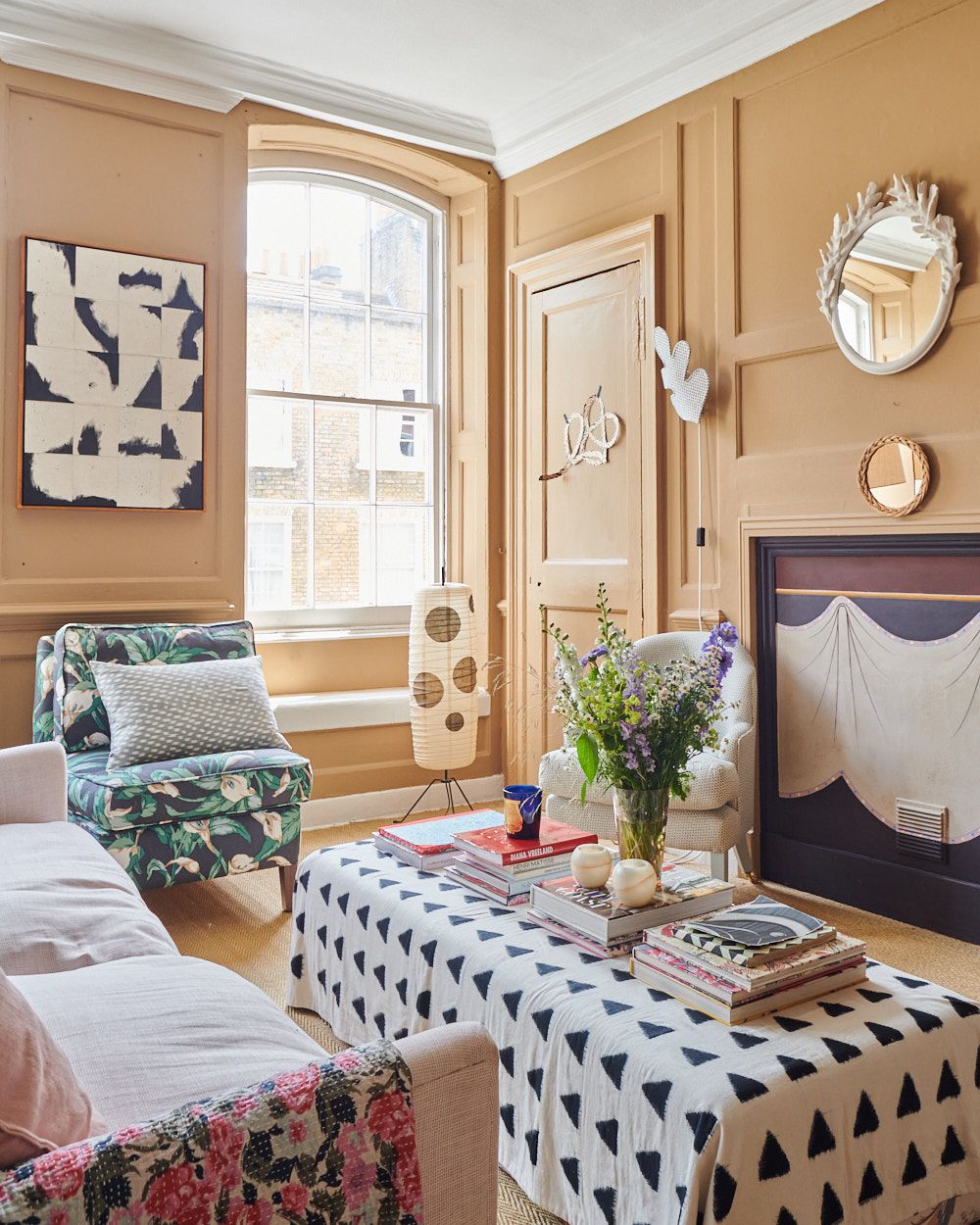
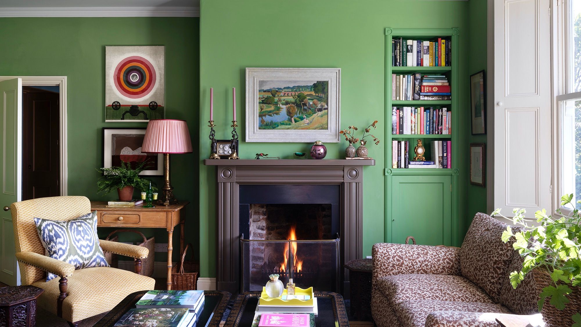
Instead, when designers approach a dimly lit room, they lean into the lack of natural light and go for deeper, more saturated colours that don’t need the sun to shine. Nina Campbell is a firm advocate of this approach: ‘I believe in embracing that dark little room and making it richer in colour and darker in colour, and relying on good—warm lighting.’ Rich jewel-tones, or ambient mid-tones, make dimly-lit rooms feel intentionally atmospheric and cosy rather than accidentally gloomy.

White paint deserves its own conversation beyond the dark-room question. ‘White’ is not a single colour, especially when it comes to paint. It’s a category with hundreds of shades with wildly different undertones — warm whites, cool whites, whites that read cream in one light and almost grey in another. Understanding how to choose the right white is a skill in its own right.
Ensuring colours work from room to room
No room exists in isolation, which is why it’s important to consider your entire space when choosing a paint colour.
This is particularly true of the ground floor of a house, where rooms tend to lead into one another, leaving your eye to wander between spaces. A colour choice that looks perfectly resolved in one room can feel jarring when viewed through the vignette of a doorway. This could be an intentional effect in your design, or something you’d rather avoid. Regardless, experienced designers always consider the entire home when choosing a palette.
Rita Konig is clear on this: ‘I think it’s very important to think of how colour leads from one room to another. Whether that palette is very neutral, or whether it’s stronger colours, or whether it’s wallpaper to paint.’
This doesn’t mean every room needs to match, or that you are committing to a single palette throughout. It means being thoughtful about the transitions, and intentional about when, where, and how you use contrast. A saturated dining room might work beautifully next to a softer hallway, as long as the relationship between the colours has been considered. This is where understanding colour theory can play an important role in your decorating process. As Edward Bulmer advises, ‘What will help you if you want to combine a lot of colours, or a little, is to ensure that the underlying tonality is being taken care of.’
Another common source of decorating anxiety is assessing paint in a room that is not finished yet. Seeing Edward Bulmer’s ‘Invisible Green’ on the walls, with no furniture, no fabric, no distraction, can feel alarming. That's why learning to visualise a finished room, and resisting the temptation to rush out for a new colour before the room is finished, is one of the more valuable skills a designer can develop.
As Rita says, ‘Don't panic because colour changes so much that when it goes up on a building site, what you are seeing is not the end result. Hold your nerve, don't panic and change course. Stick with what you liked.’
How to test paint colours properly
Testing paint colours is a step that most people tend to rush, but it is key to choosing the right colour for your space.
Many people will order paint based on how it looks on a screen or a tiny swatch on a paint chart, and then wonder why it looks so different on their wall. Remember, colour doesn’t exist in a vacuum; it changes depending on its context. As Kate Watson Smyth says: ‘Looking at paint on screen is not the same as seeing it in real life. There are so many factors that come into play when you take it out of your computer and put it on your wall. And if you just do that, you will go wrong sooner or later.’
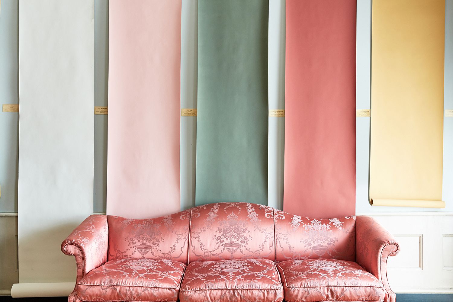
You might know to get tester pots, or peel-and-stick samples, but experienced designers know there is an art to testing paint correctly. Resist the temptation to paint a row of swatches directly next to each other on the wall. Colours in proximity will influence each other, sometimes dramatically.
In her course, Rita Konig advises, ‘Do not go to the paint shop, choose 25 colours and then paint them all over the wall. All the colours next to each other will inform one another. Pink next to white looks completely different to pink next to yellow.’ Instead, paint each colour on a separate piece of A4 card, and assess them individually before comparing.
The most crucial part of testing paint colours properly is observing what happens to your swatch throughout the day. Once you’ve narrowed down your choices, Edward Bulmer recommends painting a large swatch directly onto the wall, on a large piece of cardstock, or on wallpaper lining if you want a larger sample, and watching ‘how the paint changes during the course of the day.’ Morning light, afternoon sun, overcast skies, and lamps in the evening: choosing a colour that passes all those tests is a colour you can commit to with confidence.
When to choose your paint colour
One of the more practical pieces of advice that tends to get buried is determining when in the decorating process to choose your paint. Some prefer to start with a colour in mind, others might wait until a project is nearly complete to find that winning hue. Whatever their preference, designers agree that the key to creating a cohesive scheme is to find a fixed constraint. As Gabby Deeming says, ‘It can be really good to start with something that's quite concrete that you can hinge all your ideas from.’
Some designers recommend choosing paint later in the design process once floors, furnishings, and other key design elements are in place. Saving your paint choice for last can help take some of the pressure off the colour decision itself. When you’re responding to fixed design elements, the palette tends to reveal itself more readily than when you try to choose everything all at once.
Paint is also far easier and cheaper to adjust than flooring or joinery. As Kate Watson-Smyth explains: ‘You should really be choosing the paint last because it’s the easiest thing to change. If you change your paint a lot, then it’s going to get very expensive…’
Many designers also choose to start a project with a colour in mind. You might instantly know that a room will suit a certain hue, or you may already have a rug or fabric in mind, and this can be an excellent starting point for a scheme. As Gabby Deeming shares, ‘sometimes, you're drawn to particular palettes, and it can be quite fun to explore those… And also, it'll keep you on track. If it's one thing you're beginning from that you really love, then you know you're kind of always going to be heading in the right direction. If that's the thing that you keep coming back to.’
Wherever you choose paint in your decorating process, having a constraint in place will help narrow your decision.
Working with colour across walls and ceilings
Once you’ve landed on the perfect paint colour, there’s still the question of how to handle it across different surfaces.
Mouldings, ceilings, and joinery often require different finishes or colours to make a room look truly put together. Most paint companies, like Edward Bulmer Paint, will offer a wide range of shade options and finishes for a single colour. Consider playing with these textures and saturations across different surfaces.
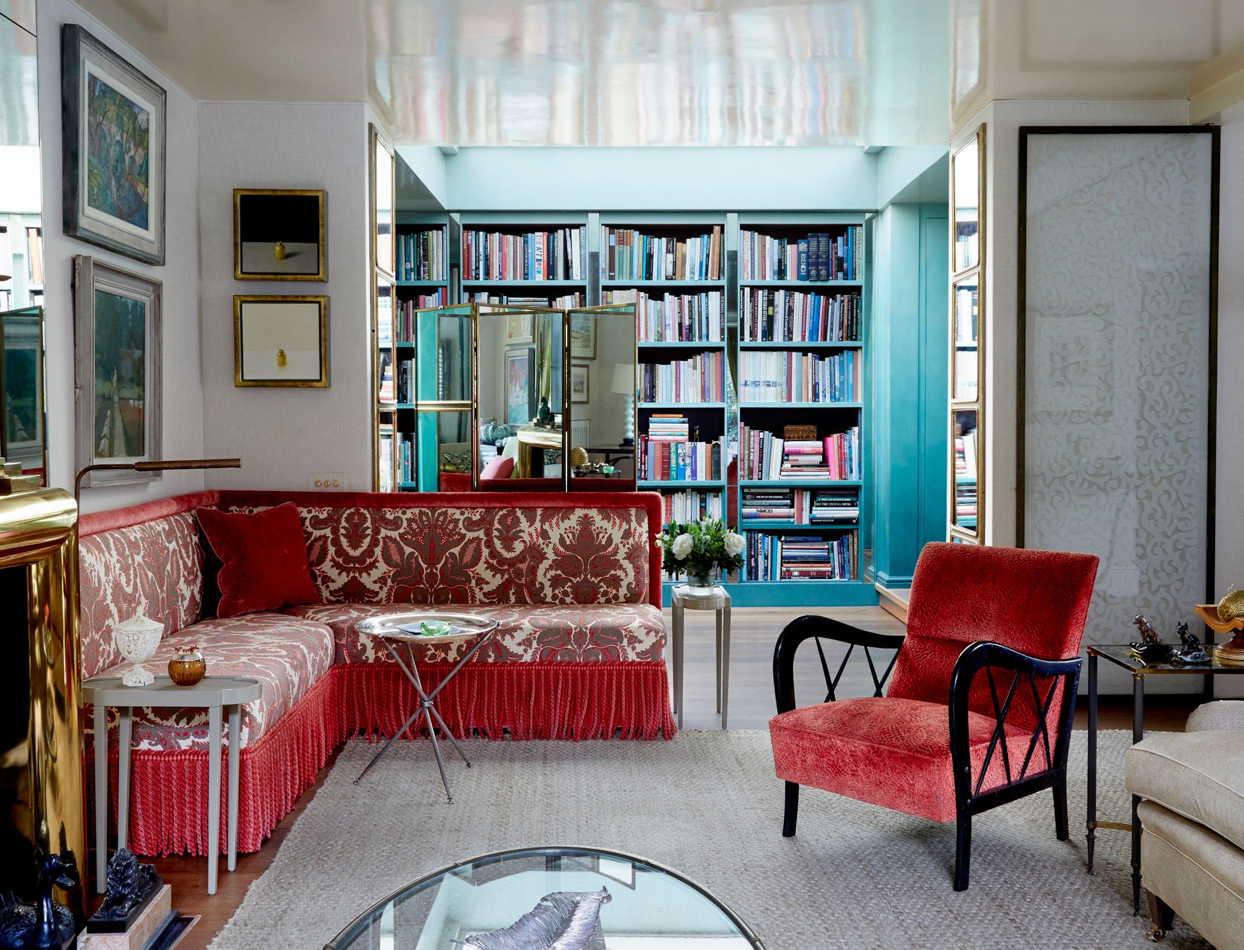
Ceilings in particular are an underused design element. They’re often an afterthought, and the instinct to paint them all white is nearly as reflexive as the instinct to paint dark rooms light. But as we know, white is not always the best option. Trends like colour drenching, where the same colour is used across the walls and ceilings, and colour capping, where a similar or contrasting shade is used on the ceiling, are great techniques to help your space feel more considered.
Nina Campbell offers a particularly useful approach for rooms with dado rails or existing mouldings, or for those thinking about adding them: ‘start off with a paint colour you like and then above the chair rail, bring [the saturation] down 30%. And then, once you go to the ceiling, I’d bring it down another 20%. That way, you’ve got this slight contrast which takes your eye up.’
The effect is subtle but sophisticated, and adds visual layering and perceived height to a room without introducing a second colour. It is also a good example of the kind of technique that looks like instinct but is actually a learned design principle.
The designers who approach paint colour well are not necessarily the ones with the most innate flair. They’re the ones who understand how light works, how colour behaves in context, and how to test and evaluate their choices methodically before committing. Design confidence comes from knowledge, practical methods, and practice.
Our courses with Kate Watson Smyth, Rita Konig, Gabby Deeming, Edward Bulmer, and Nina Campbell go much deeper than the foundational principles outlined here. If you want to dive deeper into the concepts, techniques, and principles behind colour and design, these courses are a great resource for learning: