


.jpg)
.jpg)

Interior and exterior confidence
Create Academy has been such a great resource. I'm in the middle of renovating a bungalow with a very large garden and the courses have offered a wealth of inform...
Harvey
Jun 10, 2026
The Ultimate Guide to Interior Design
with RITA KONIG — Internationally renowned interior designer. AD100, House & Garden Top 100, Elle Decor A-List.
Lesson 12 of 36
Subscribe to watch
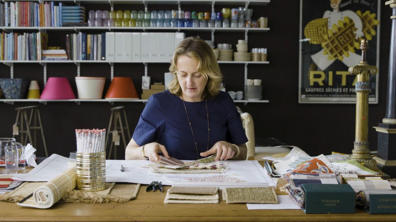
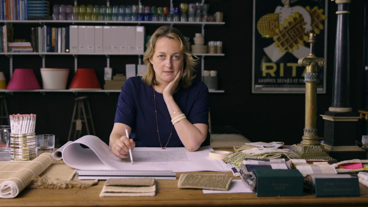
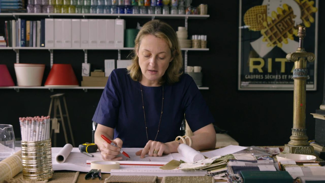
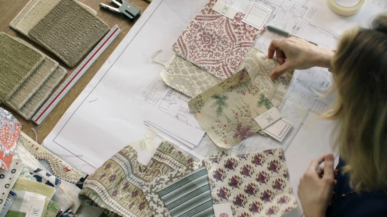
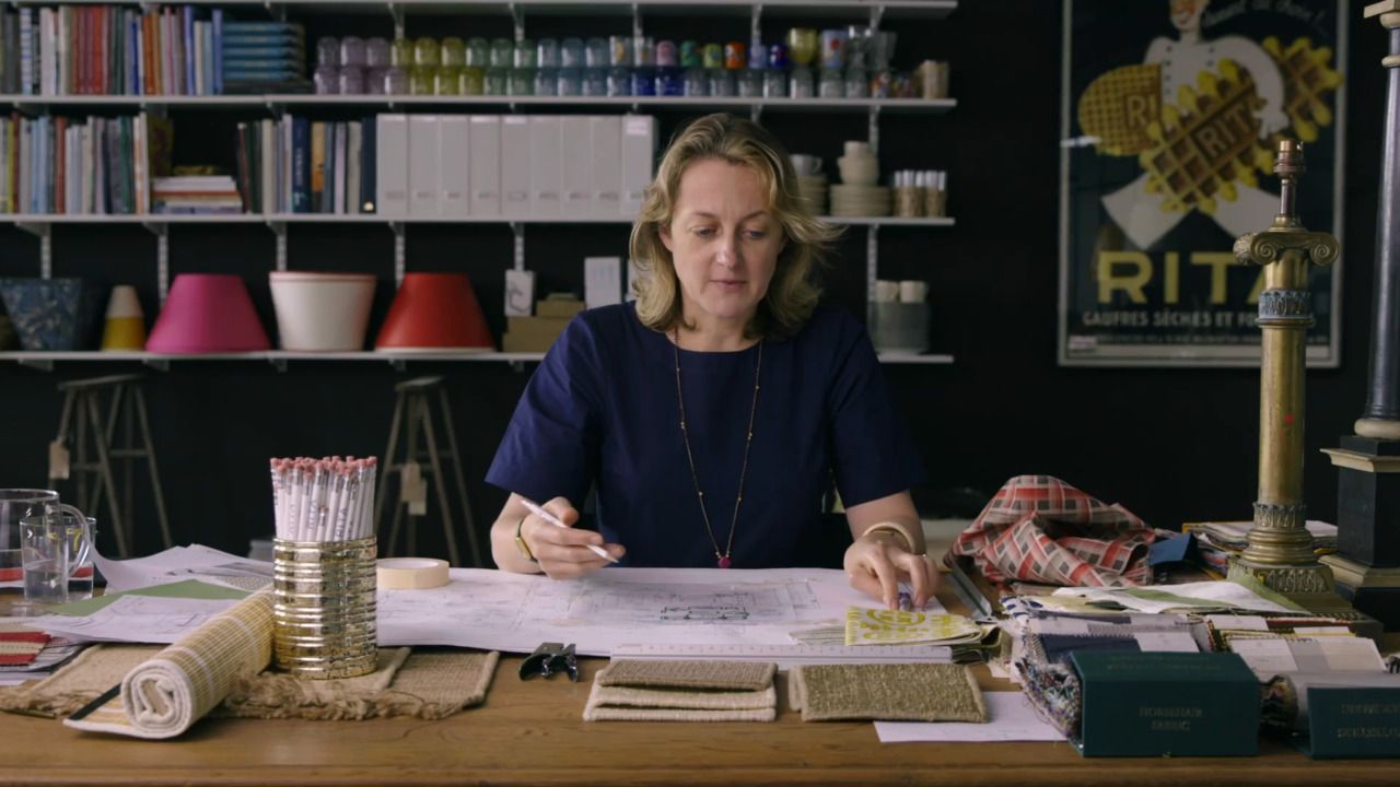
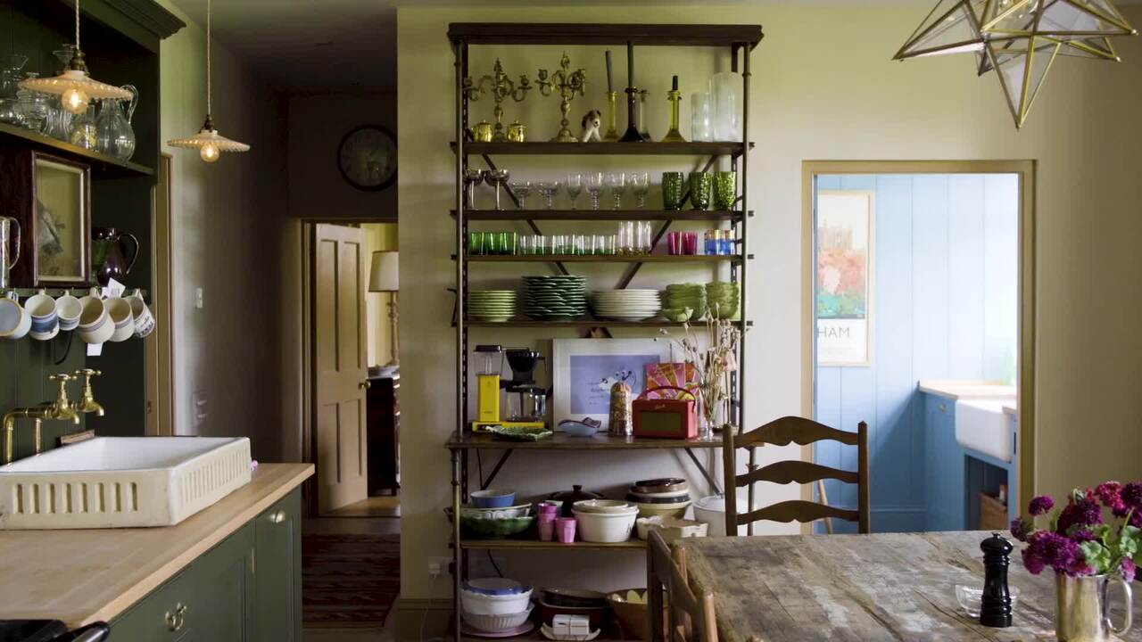
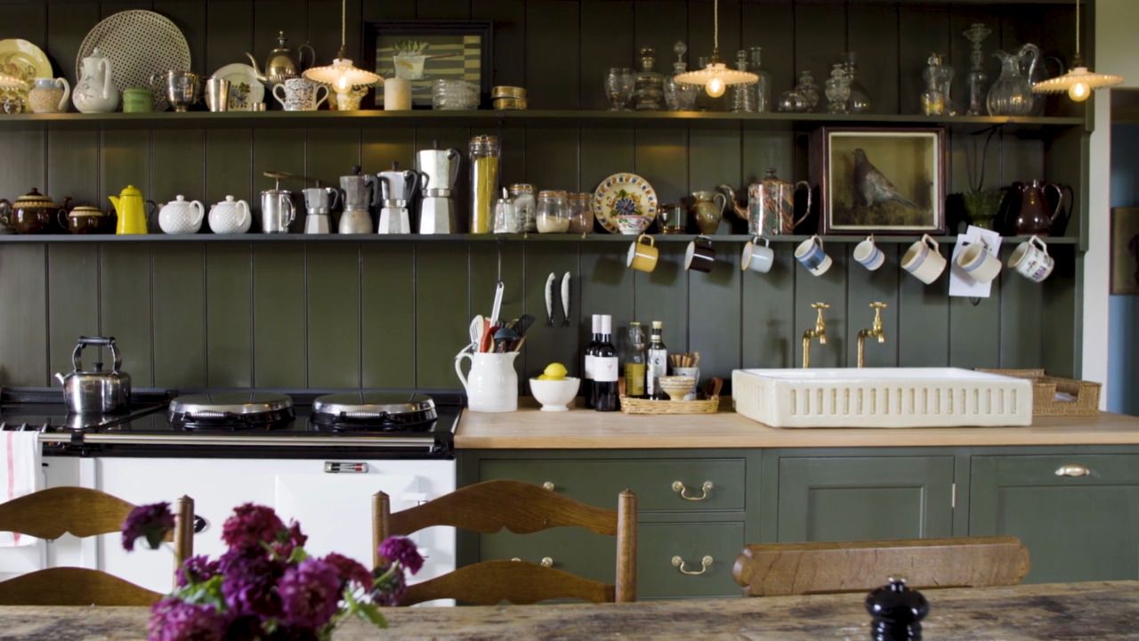
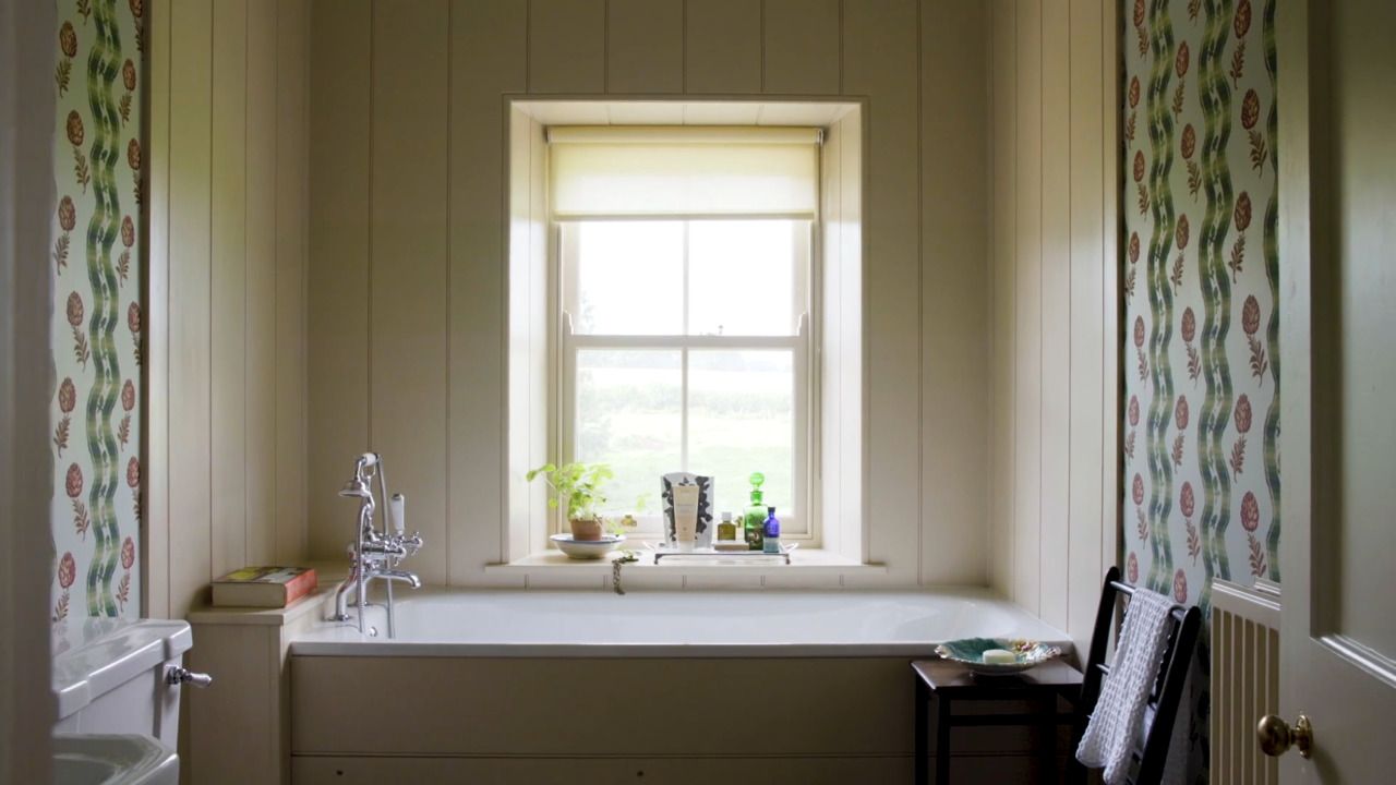
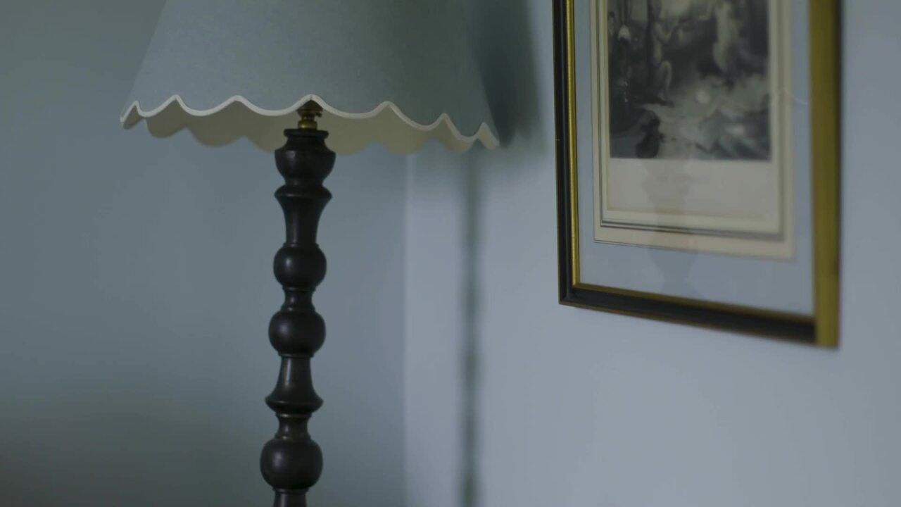
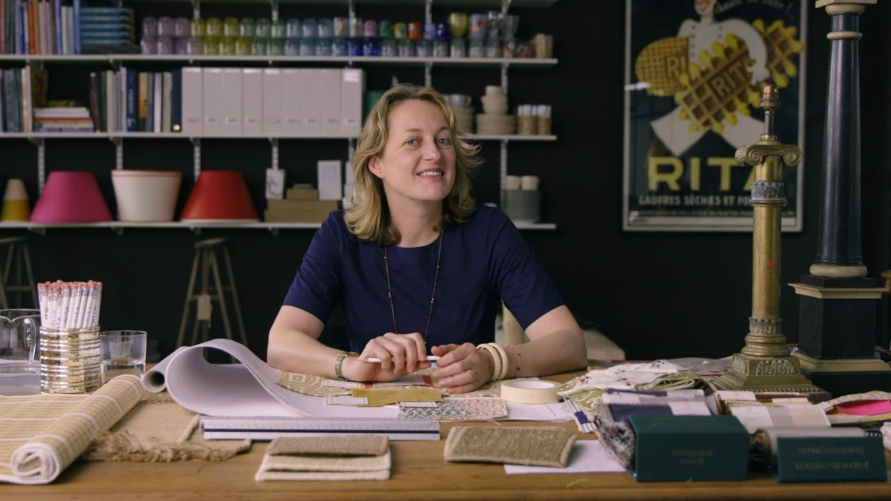
In this next phase of the process, Rita walks you through drawing a colour palette together, advises how to get options up on your walls without creating confusion, and helps you consider the flow of colours throughout your house.
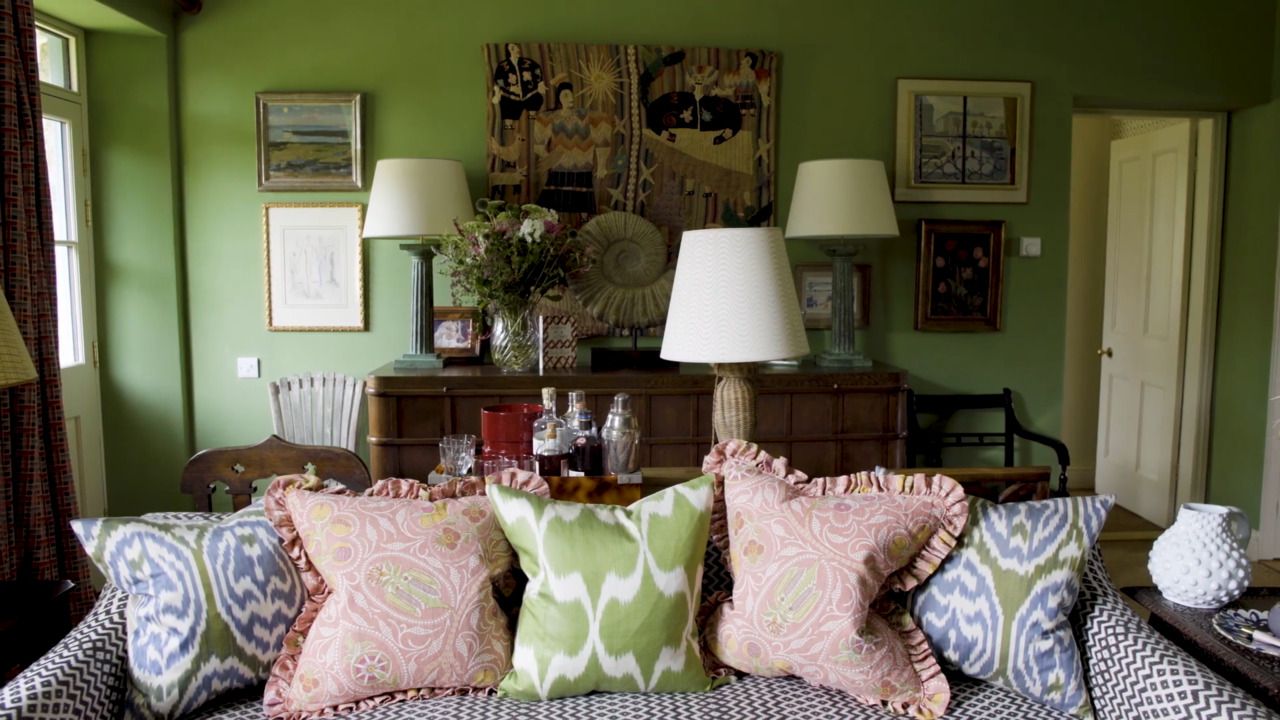
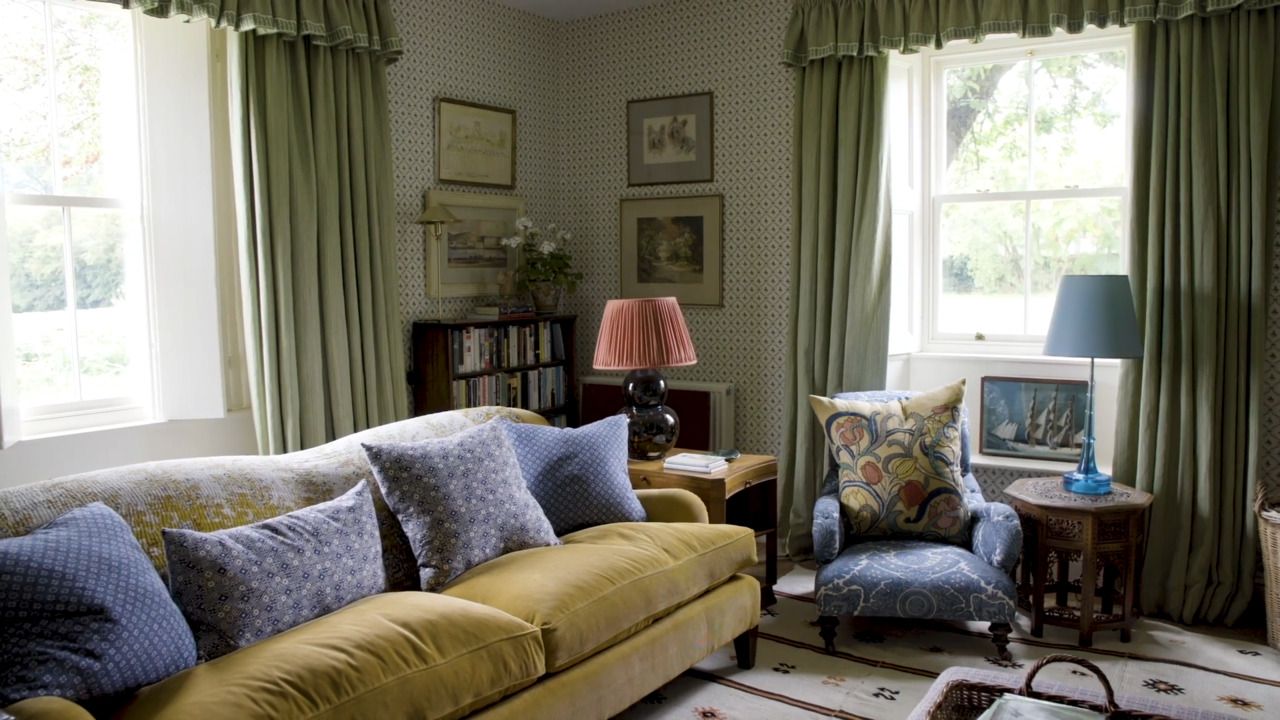
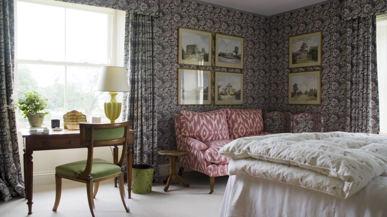
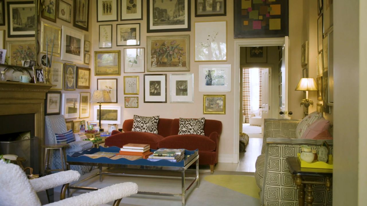
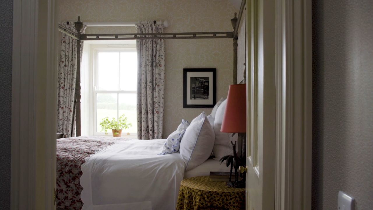
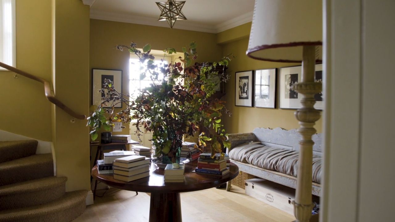
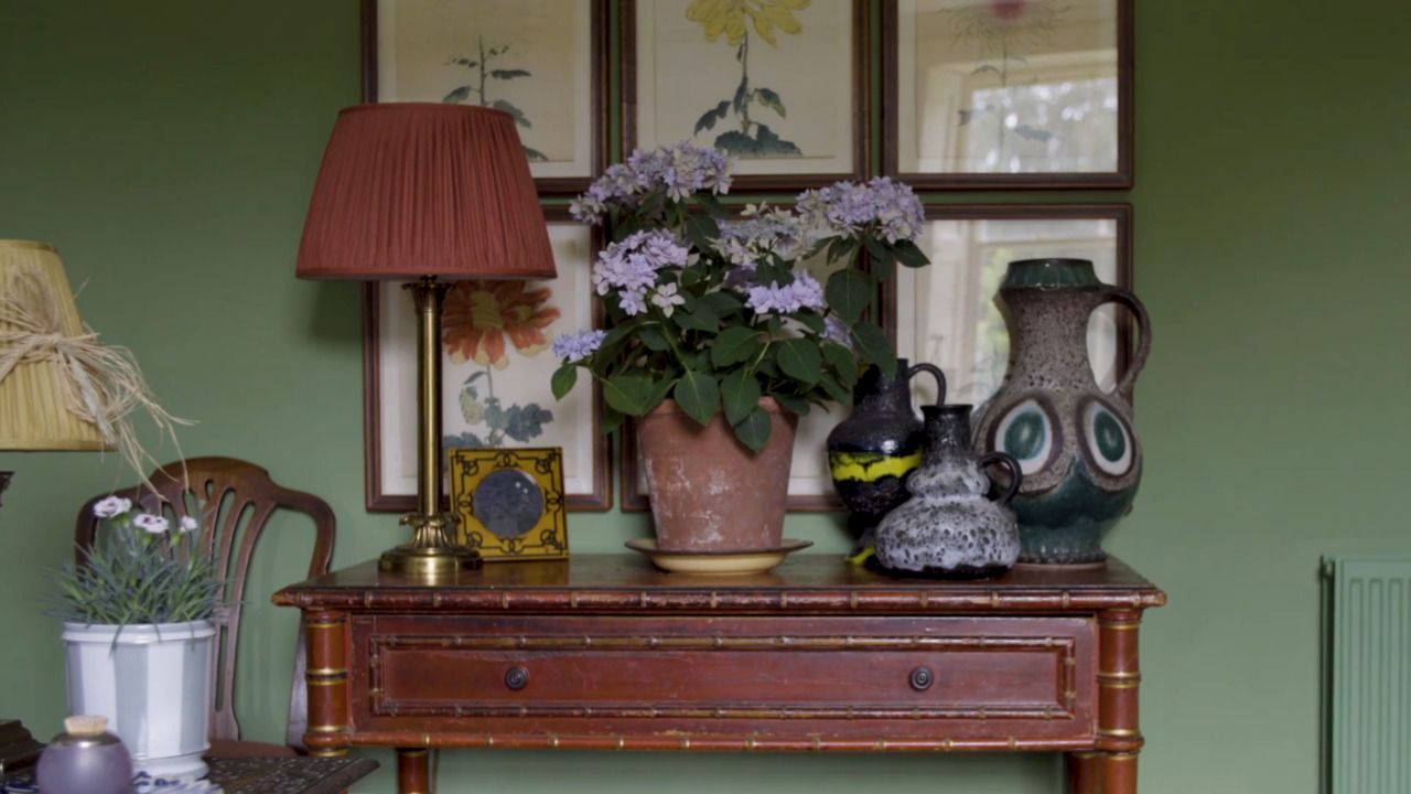
As you're beginning to pull colour together, make sure you consider how one room flows to another. Adding a touch of colour in one room that another room is painted in (for example) provides flow.
Colours next to each other inform one another. Paint bits of cards in order to see colours independently.
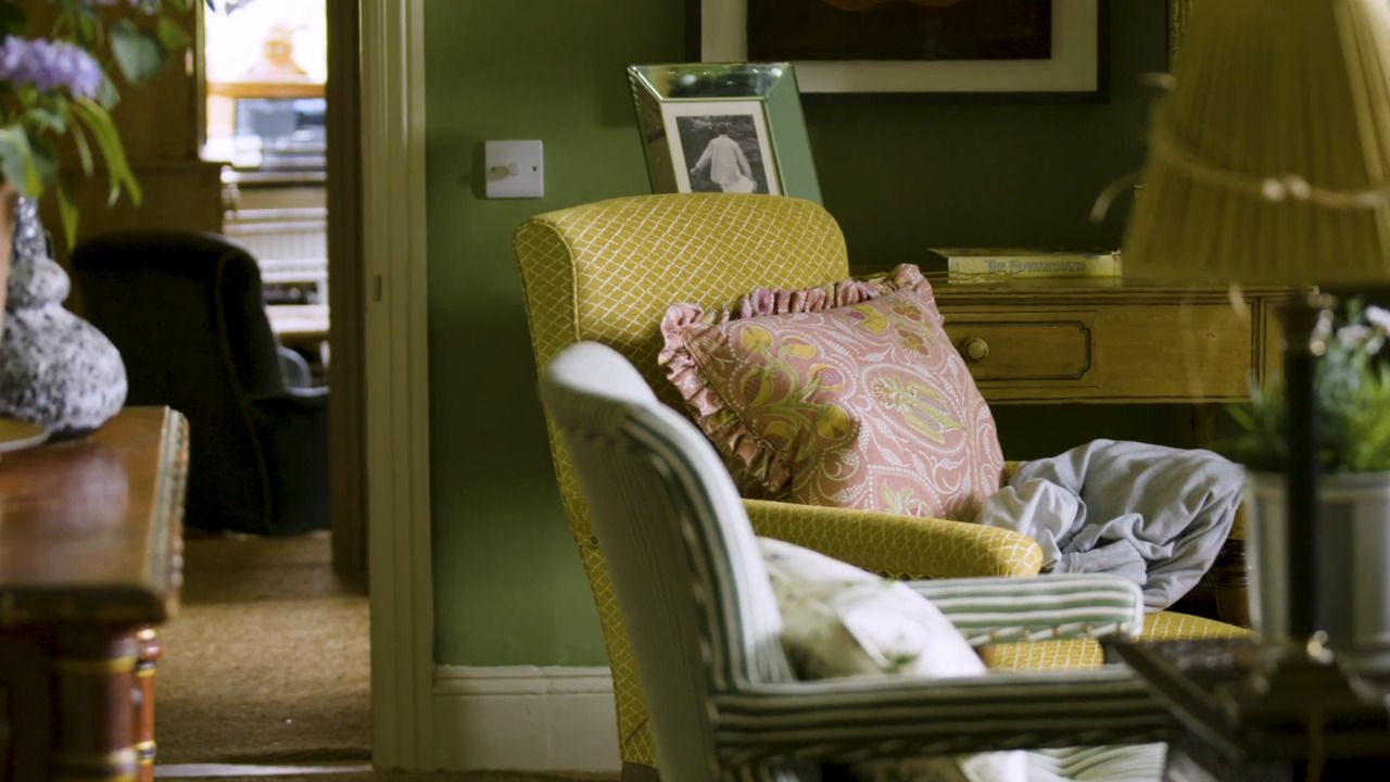
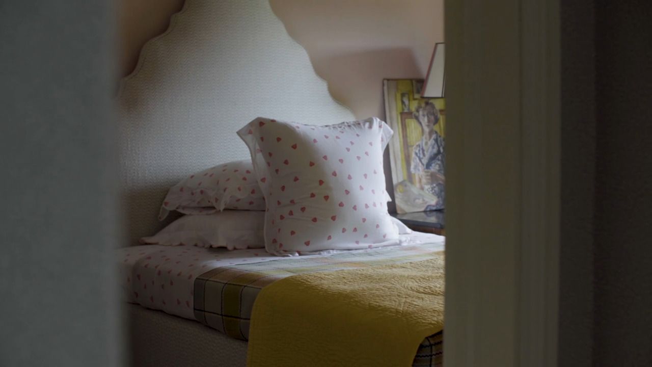
Similarly, having splashes of the same colour in different formats (a chair has a little of the same pink as a picture, for example) gives consistency.
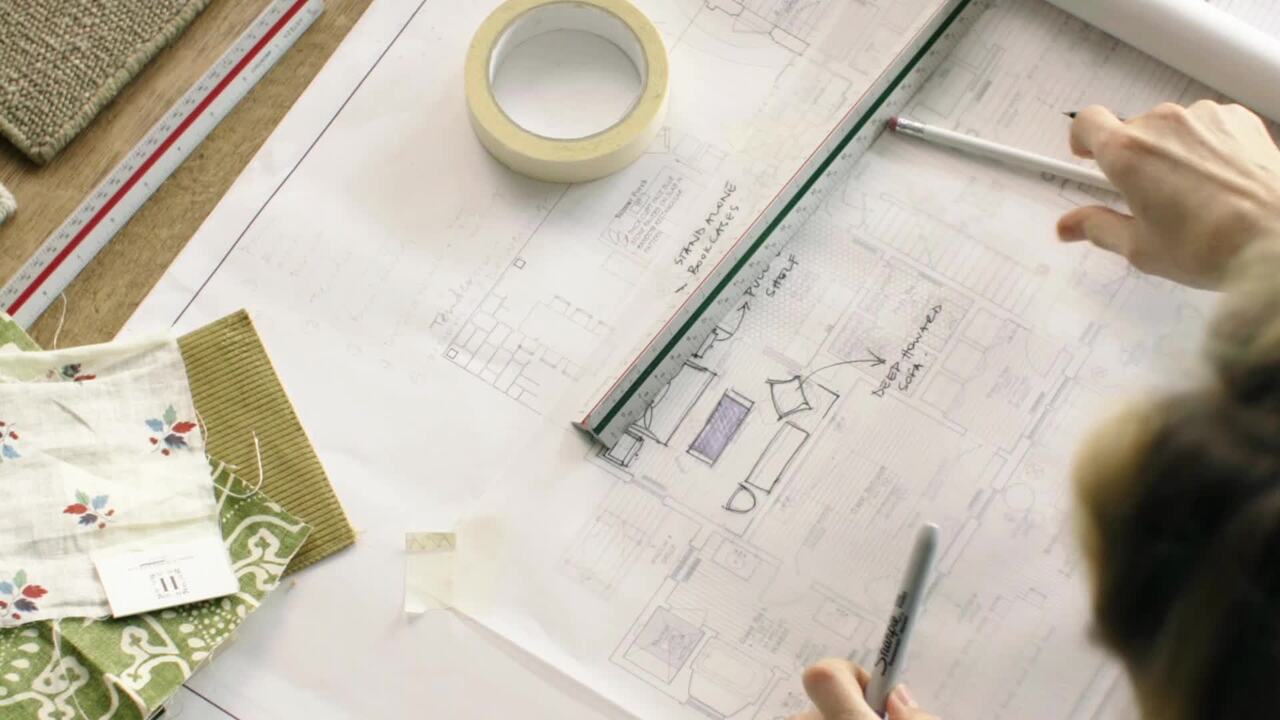
The organisation is key: keep all your samples and colours in a labelled plastic wallet for each room, making sure you label each sample.
Choose something then stick with it. Better to hold your nerve, as often changing your mind has a knock-on effect and will cost you money. Also, when mixed with furniture, pictures and people, a room colour looks very different.
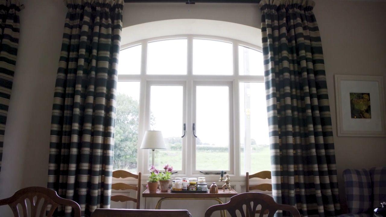
Knowing a room's orientation and, therefore, when and how natural light enters a space is critical to choosing colours. When trying to determine a room's orientation, your phone is a good place to start. You should point the compass towards the largest window in the room, whichever direction the dial points. In a room with a double (or even triple) aspect, the light will benefit you from many directions.
Generally, northern light brings out the cooler tones in a colour. Whenever possible, try to stay away from green or grey colours if you're using a lighter tone. Consider hanging a light-reflecting mirror and using darker wall colours to create a cosy atmosphere.
South-facing spaces are filled with bright natural light, so any colour will work well. A cool colour scheme like blue, green or violet can balance the sun's intensity. It is possible to create a calm and breezy atmosphere in even the brightest rooms by using these shades.
A room facing east will benefit from natural light in the morning, while a room facing west will get natural light in the late evening. These rooms take some extra consideration when picking colours. Blue, green, and violet are cooler colours that will balance the intensity of the sunlight if the room faces east and is mainly used in the morning or west and is mainly used in the evening.
My favourite paint companies are Edward Bulmer and Little Greene.
A hue is a pure colour without the addition of any tint, shade or tone. This includes primary, secondary and tertiary colours that can be found on the colour wheel.
A tint is a hue of a colour where white is added. Pastel colours are examples of tinted colours. A tint is lighter than the original colour.
A tone is the hue of colour with which pure grey is added. A tone is softer than the original colour.
A shade is the hue of colour with which black is added. A shade is darker than the original colour.
The colour wheel consists of twelve hues and is broken down into, primary, secondary and tertiary colours.
Primary colours
Yellow, red and blue.
Secondary colours
These are colours that are made by mixing together primary colours (orange, purple and green).
Tertiary colours
These are colours that are obtained by mixing together the primary and secondary colours.
Get the full workbook, video lessons, and more with a Create Academy subscription.
Subscribe to access the full workbookAlready a member? Sign in to watch
491 reviews
Read moreCreate Academy has been such a great resource. I'm in the middle of renovating a bungalow with a very large garden and the courses have offered a wealth of inform...
Harvey
Jun 10, 2026
Absolutely love Create Academy! The instructors are extremely informative, and it is beautifully filmed. Create Academy is great value for money and plan on renew...
SG
May 31, 2026
Butter's creativity is stunning! Her ability to incorporate brilliance in small gardens is magical!
Carla
May 30, 2026
The best adventure. I like all the courses, but my favorite are both Rita Konig interior design courses and Anna Jones. Excellent!
Karolina Kluczewska
May 20, 2026
Create Academy has been such a great resource. I'm in the middle of renovating a bungalow with a very large garden and the courses have offered a wealth of information to dive into and explore new ideas. I'm...
Harvey
Jun 10, 2026
Absolutely love Create Academy! The instructors are extremely informative, and it is beautifully filmed. Create Academy is great value for money and plan on renewing my subscription yearly because there are ...
SG
May 31, 2026
Butter's creativity is stunning! Her ability to incorporate brilliance in small gardens is magical!
Carla
May 30, 2026

Your Instructor
Internationally renowned interior designer. AD100, House & Garden Top 100, Elle Decor A-List.
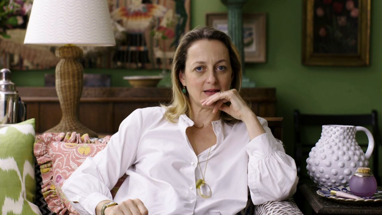
Rita’s effortless style has made her one of today’s most sought after interior designers, with her writing and work a staple of Vogue, The New York Times, House & Garden and The Wall Street Journal. She is an expert at bringing refined, relaxed comfort to a home, and is passionate about sharing her expertise and empowering people to decorate and design their homes themselves.
Access to all courses


