
Interior and exterior confidence
Create Academy has been such a great resource. I'm in the middle of renovating a bungalow with a very large garden and the courses have offered a wealth of inform...
Harvey
Jun 10, 2026
Subscribe to watch
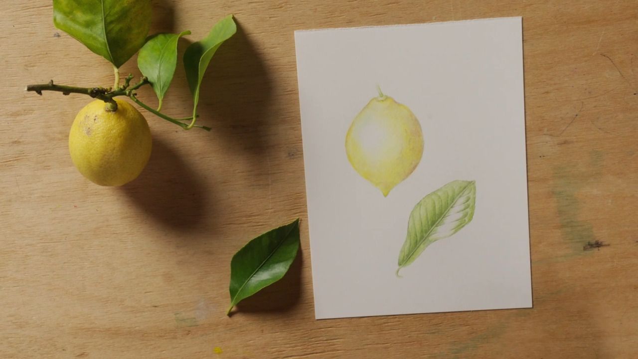
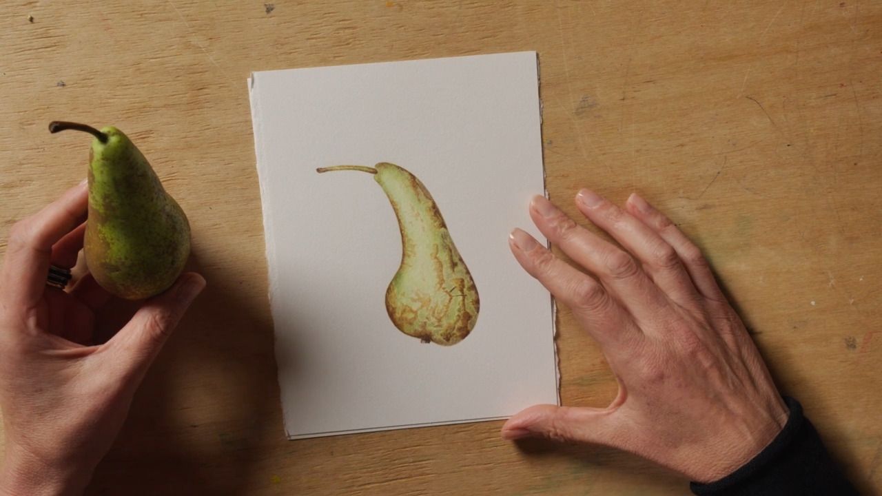
Many fruits, vegetables and plants have a characteristic shine on their surface, and capturing this is an important part of communicating its form to the viewer. This lesson will take you through the process of introducing this in your watercolour paintings.
There are plenty of fruits and vegetables that have a characteristic shine on their surface, so it's well worth learning how to represent this when botanical painting.
There are lots of things you might like to paint that have a shine to their skin; cherries, tomatoes, peppers or aubergines for example.
Botanical watercolourists don't tend to use a stark white paint in their work - instead, the technique involves letting the white of the paper convey the shine and juxtaposing this with surrounding areas of bold colour.
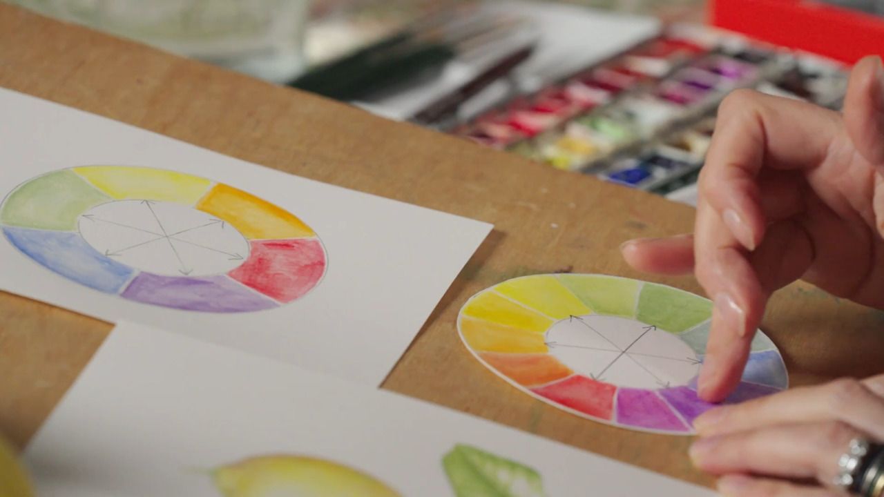
The primary colours are red, yellow and blue.
In between these sit the secondary colours; green, purple and orange.
The secondary colours are also known as the complementary colours, meaning they enhance and complement the colour they sit opposite to create pleasing combinations; red and green, yellow and purple, blue and orange.
A colour wheel can be a helpful reference when mixing colours. For example, because they are complementary colours, red can be added to green to make it darker. Similarly, yellow can be darkened effectively with its own complementary colour; purple.
I use the Da Vinci Nova 5570
Slightly old and worn out brushes for mixing paint colours
I am using Cadmium Scarlet, Winsor Red, Permanent Alizarin Crimson, Aureolin Yellow, Cobalt Blue, Raw Sienna, Burnt Sienna, Burnt Umber and Walnut Brown, all from the Winsor & Newton Professional watercolour range in the half-pan size.
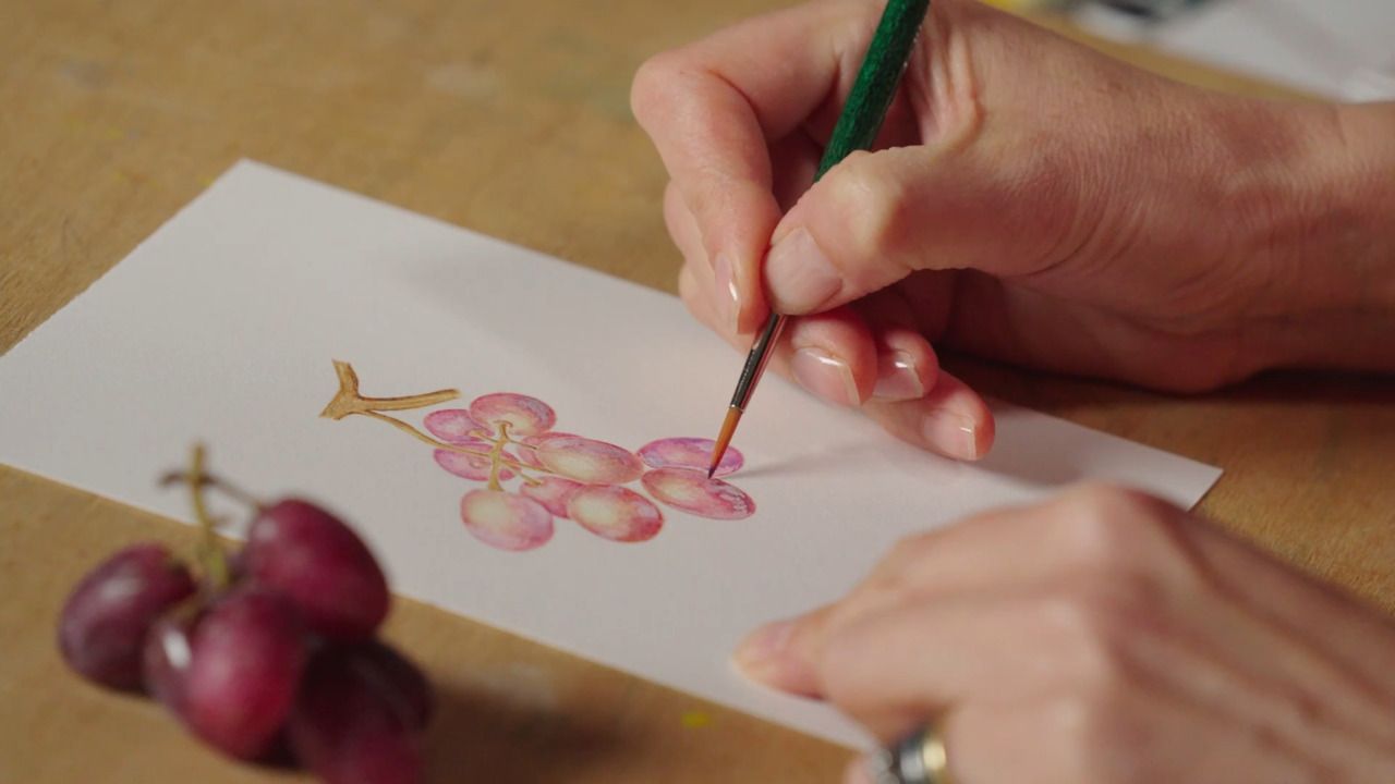
When we painted the shallot, we were aiming to make the transition from light to dark as smooth as possible. Now, we are trying to make the difference between colours abrupt to create the illusion of shine effectively.
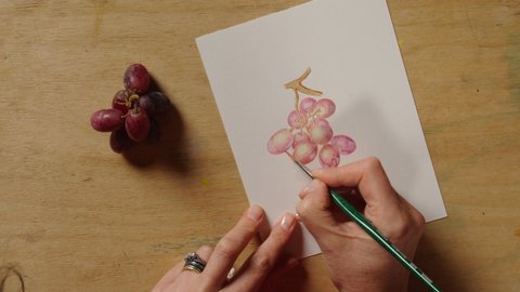
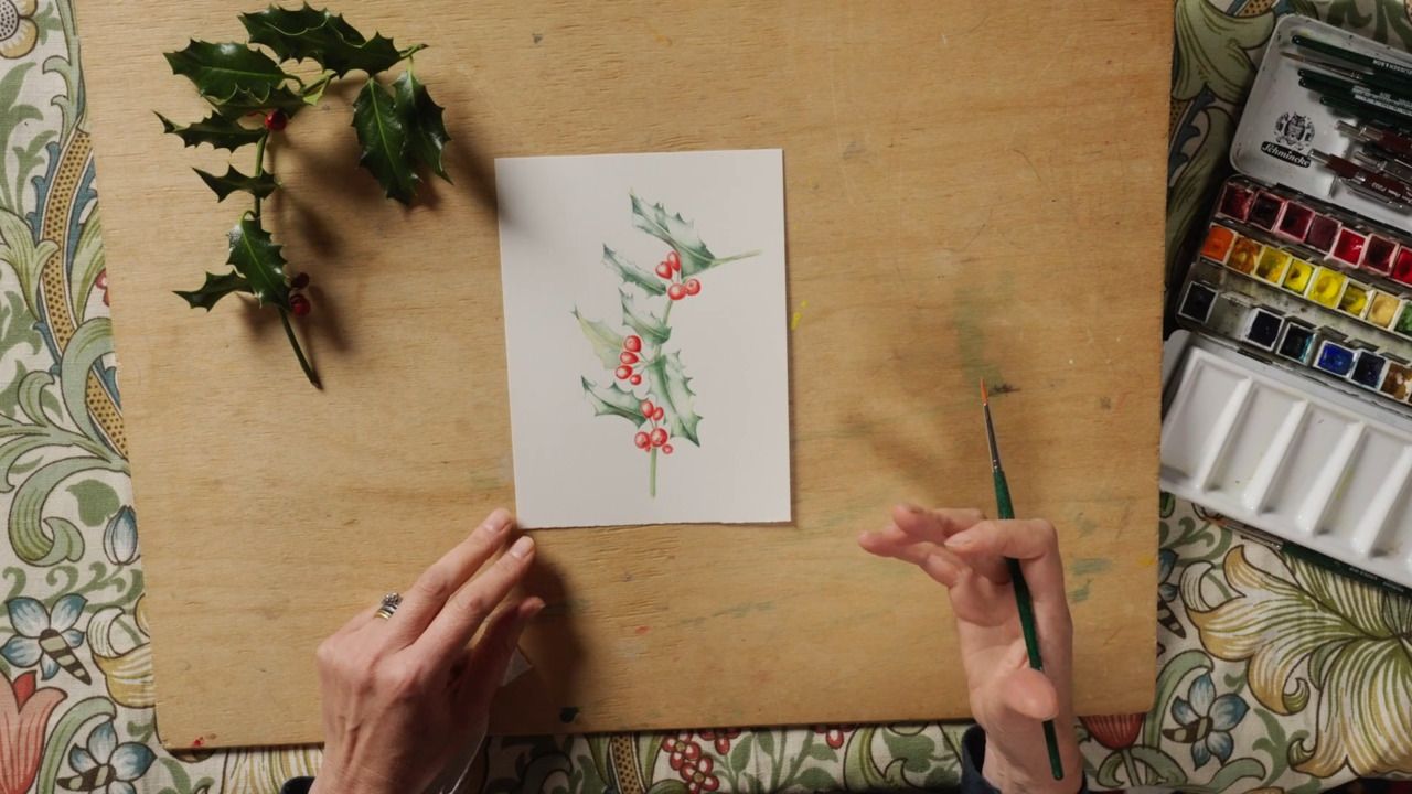
I am using various shades of red to build up a deep colour around the outside of the rosehip that contrasts with the stark white of the paper that I'm leaving blank in the centre.
I also like to mix a green using blue and yellow, which I then add to red to make a murkier, darker shade of red which I use for the underside of the rosehip.
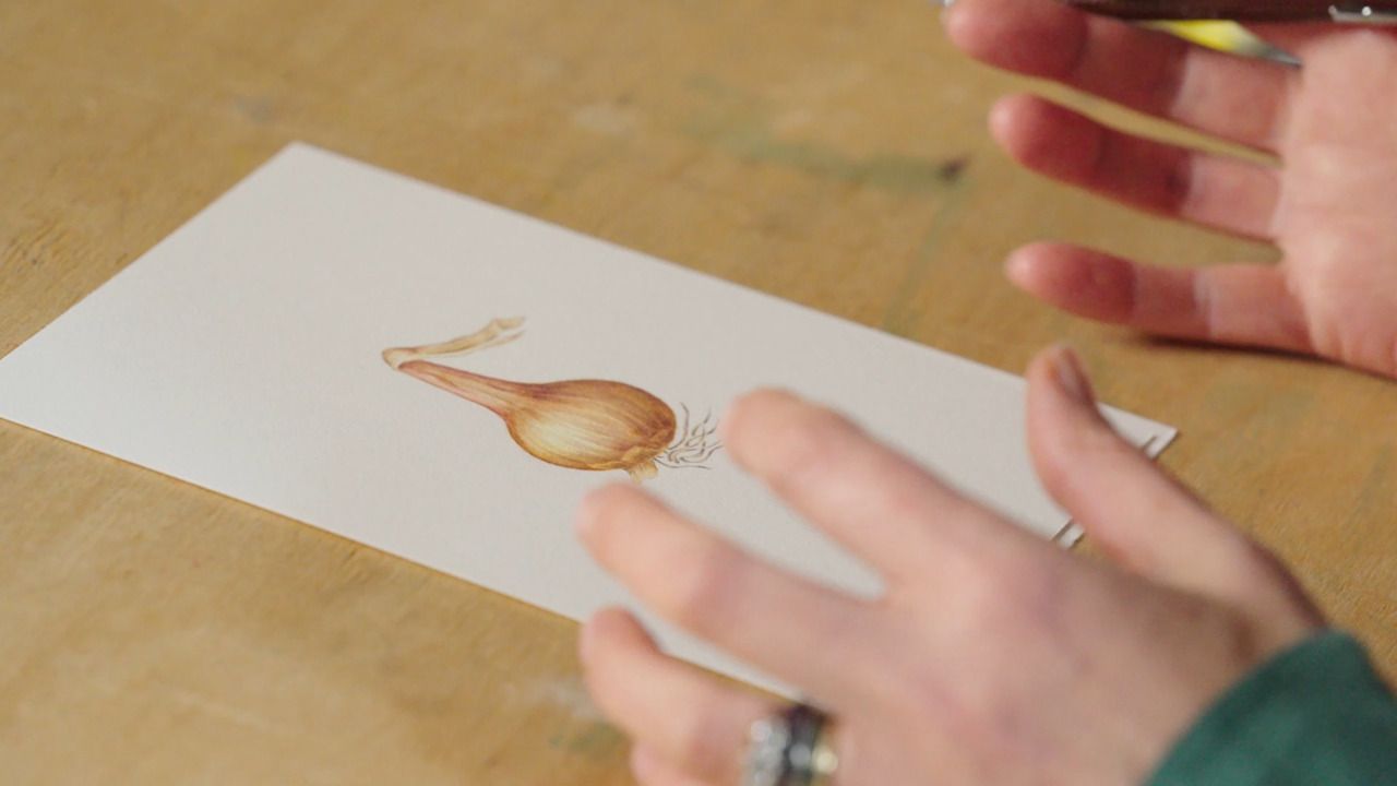
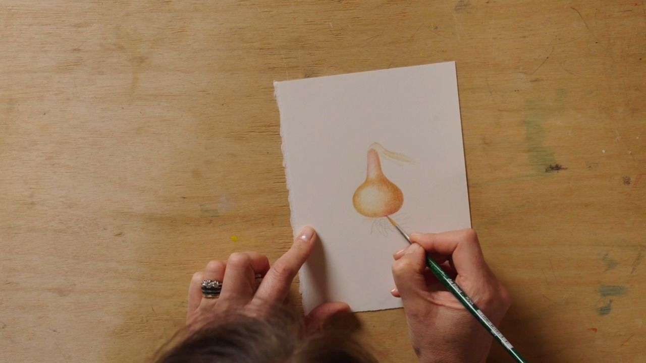
Step 1
Draw the outline of your rosehip using pencil, and once you're happy with the shape, gently buff away your pencil lines so they are very faint.
Step 2
Begin painting by applying a pale layer of red around the edge of the rosehip, using your brush with the tight circular motion you learnt in the previous lesson.
Step 3
Carefully work the paint towards the inner section of the rosehip, but leave an oval shaped section completely free of paint, so that the white of the paper remains - this will be your shine. I recommend leaving a bigger area that you think you might need, as you can always make it smaller but once you've painted it you can't make it bigger again.
Step 4
This technique relies on the area you are painting to be dry, so move around your work and paint other elements of the rosehip while you're waiting for the red head to dry.
Step 5
Each time you come back to the rosehip head, build up more layers of darker red that graduate slightly lighter at the edge of your shine.
Step 6
Once you're happy with how the layers of red look, you can finish off by going in with flashes of bold colour right on the edge of your shine to make the contrast more vivid.
Get the full workbook, video lessons, and more with a Create Academy subscription.
Subscribe to access the full workbookAlready a member? Sign in to watch
479 reviews
Read moreCreate Academy has been such a great resource. I'm in the middle of renovating a bungalow with a very large garden and the courses have offered a wealth of inform...
Harvey
Jun 10, 2026
Absolutely love Create Academy! The instructors are extremely informative, and it is beautifully filmed. Create Academy is great value for money and plan on renew...
SG
May 31, 2026
Butter's creativity is stunning! Her ability to incorporate brilliance in small gardens is magical!
Carla
May 30, 2026
The best adventure. I like all the courses, but my favorite are both Rita Konig interior design courses and Anna Jones. Excellent!
Karolina Kluczewska
May 20, 2026
Create Academy has been such a great resource. I'm in the middle of renovating a bungalow with a very large garden and the courses have offered a wealth of information to dive into and explore new ideas. I'm...
Harvey
Jun 10, 2026
Absolutely love Create Academy! The instructors are extremely informative, and it is beautifully filmed. Create Academy is great value for money and plan on renewing my subscription yearly because there are ...
SG
May 31, 2026
Butter's creativity is stunning! Her ability to incorporate brilliance in small gardens is magical!
Carla
May 30, 2026
Your Instructor
Leading British botanical artist
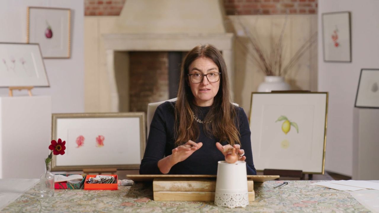
Katharine Amies is a leading British botanical artist. Katharine's work seeks to capture the intimate essence of plants in a manner that photographs, despite their detail, fail to convey. Katharine trained at the Chelsea Physic Garden in 2000. Her work is represented in the Shirley Sherwood Collection of Botanical Art at Kew Gardens which is the largest collection of contemporary botanical art in the world.

Access to all courses


