How to paint a spherical specimen in colour - Part 1
with KATHARINE AMIES
Lesson 5 of 16

Already a member? Sign in
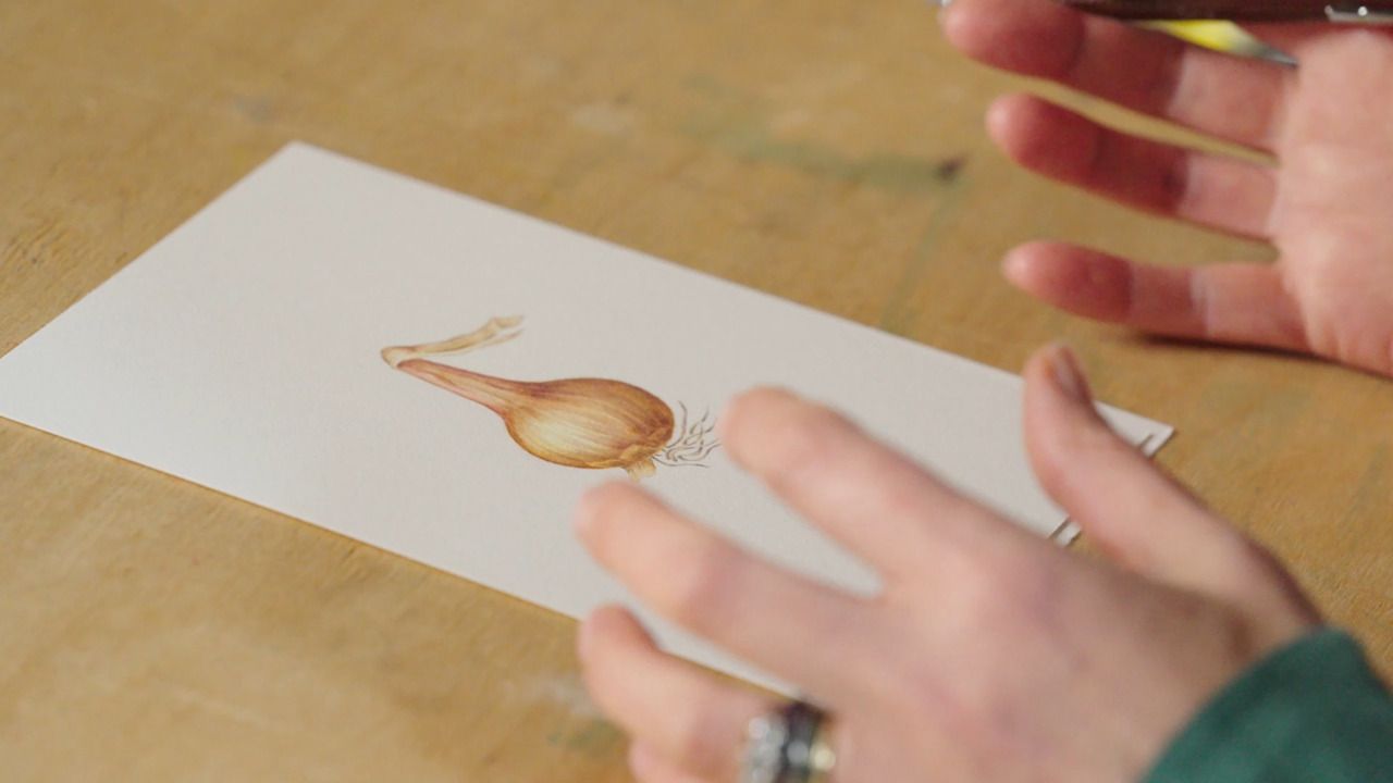
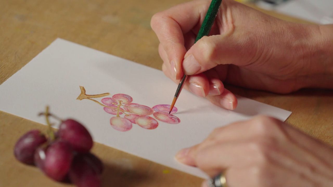
With an understanding of the relationship between light and shadow, you will now move onto applying this to colour. Sticking with the example of a shallot, Katharine shows you the tips and tricks of using watercolour paints to enhance the illusion of form.
From the Lesson Workbook
How to Paint a Spherical Specimen in Colour: Parts 1 & 2
We are now moving onto working in colour. Sticking with the example of a shallot, I'll be showing you the tips and tricks of using watercolour paints to enhance the illusion of form.
Working in Colour
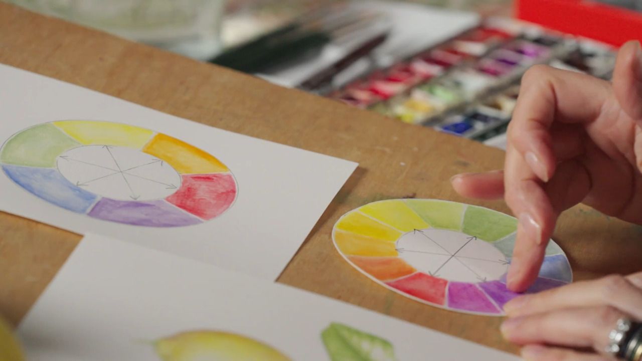
Using colour is a powerful tool in botanical painting; it helps to further communicate the intricacies and characteristics of your specimen.
The same essential principles of light and shadow that we covered in the previous lesson apply, but the technique of using paint to achieve this effect is different.
When using pencil, we started with the darkest areas first and worked through to light. In painting, the process is reversed. It's always best to start with the lightest colour, and build up to the shadowed areas.
Closely observing your specimen is even more important when using colour, as there are more differences in tone to communicate.
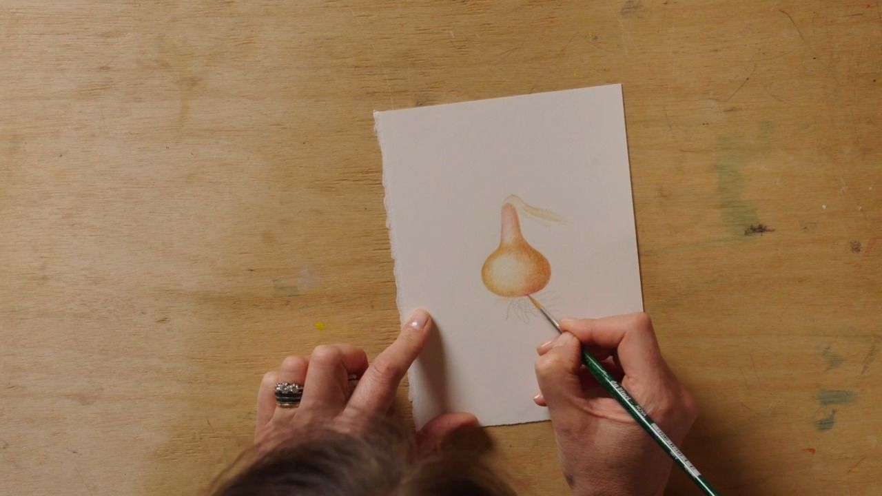
A Watercolour Painting of a Shallot
What You Will Need
- Paper
- Pencil
- A shallot specimen
- Putty rubber
- Divider
- Acrylic brushes in size 3
- I use the Da Vinci Nova 5570
- Slightly old and worn out brushes for mixing paint colours
- Jar of water
- Watercolour paints
- I am using Lemon Yellow, Raw Sienna, Burnt Sienna, Burnt Umber, Permanent Magenta, Permanent Alizarin Crimson, Permanent Rose and Cobalt Blue, all from the Winsor & Newton Professional watercolour range in the half-pan size.
- Ceramic palette
- Kitchen towel
Step 1
Select and position your specimen, then draw the outline as we did in the previous lesson.
Step 2
Use a putty rubber to lightly rub out the pencil marks so that your line drawing becomes really faint. Keep the roots as normal pencil marks.
Step 3
Select your colours. Use an old brush to extract each colour from the pan onto your ceramic palette, rinsing your brush in a jar of water and blot drying it with a kitchen towel in between each one.
Step 4
Apply a very thin wash of your lightest colour to the highlight section of your drawing on the left-hand side. Then, take a darker shade and apply as a thin wash to the darkest, most shadowy areas on the right-hand side. There are a few things to bear in mind when trying to achieve a good effect with watercolour paints.
- The key to working with watercolours is to only have a very small amount of paint on your brush, and slowly building up the layers.
- Maintain quite a dry brush by blotting with a kitchen towel often - you don't want your paper to be soaked in water as it will bulge and buckle.
- As you did with the pencil, work in tight circular motions with the paintbrush to work the paint across the paper, gradually taking the pressure off as you get into the highlight areas.
- You are aiming for a smooth effect and no tide lines, so be sure to keep moving the watercolour paint and buffing any areas of transition.
- You don't want to let the paint sit for too long; it dries quickly and is not easy to remedy. For this reason, it's best to work in small sections systematically across your painting.
Step 5
Continue to work through your colour palette to create the illusion of form, moving from the lighter to the darkest shades. Building up a solid form with lots of depth before moving on to adding any details is really important. Try not to be intimidated by colour; think back to the previous lesson and see it as a progression from the fundamentals you learnt about the contrast between light and dark.
- Remember how you used pencil shading to create the illusion of form in the previous lesson, and replicate this technique using different shades of paint.
- Use darker shades to create depth and shadows, while pale shades are your moments of highlight.
- Watercolour paints are translucent; when you apply another colour on top, it doesn't obscure what's underneath. You can use this layering effect to your advantage to build up the illusion of form and communicate the 3-dimensional nature of your specimen.
- Observe the colours within your specimen as closely as you can; there may be tiny flashes of unexpected colours and these are important to include as they really help to tell the story.
- As you work, ensure your edges are extremely crisp; the edges of a shallot are smooth so you want to try and replicate this on the page. You will need to use your best quality brush with the finest tip for this.
Step 6
Once you have built up layers of different colours and are happy with how the form of your painted specimen is looking, it's time to add the details. One of the details to tackle when painting a shallot is the roots - this is also a good case study to explain how I mix colours.
- The translucency of watercolour paints enables you to mix colours effectively on the paper through layering - and this works perfectly for most of the paintings I do.
- There are some instances where I would mix paints in the ceramic palette, and creating the colour for the shallot roots is one of them.
- To create a neutral grey, I mix the primary colours together; yellow, blue, and red. You can create various greys by adjusting the ratio of colours.
- I always start by mixing a blue and a yellow together in a ceramic palette to make green. I will then gradually add in tiny amounts of red or pink until I am happy with the tone of grey.
Step 7
Continue adding in the other details within your specimen; the sheets of skin and fine lines. Think back to the principles you learnt in the previous lesson and apply them here, using paint instead of pencil.
- Remember to paint elements that sit behind something else in a darker shade to communicate depth and layering.
- Look at your specimen and observe it as closely as you can - especially when it comes to communicating the intricate details.
- When painting in detail into the lighter sections, use lighter shades and vice versa with the darker areas.
- As you complete the finishing touches to your painting, consider whether there are any areas where you can add additional drama such as moments of depth or bright highlights.
Get the full workbook, video lessons, and more with a Create Academy subscription.
Subscribe to access the full workbookYour Instructor
Katharine Amies
Leading British botanical artist
Katharine Amies is a leading British botanical artist. Katharine's work seeks to capture the intimate essence of plants in a manner that photographs, despite their detail, fail to convey. Katharine trained at the Chelsea Physic Garden in 2000. Her work is represented in the Shirley Sherwood Collection of Botanical Art at Kew Gardens which is the largest collection of contemporary botanical art in the world.


Access to all courses