


Interior and exterior confidence
Create Academy has been such a great resource. I'm in the middle of renovating a bungalow with a very large garden and the courses have offered a wealth of inform...
Harvey
Jun 10, 2026
A Guide to Pigments, Paints & Palettes
with EDWARD BULMER — Award-winning interior designer, architectural historian, paint expert. House & Garden Top 100.
Lesson 22 of 24

Subscribe to watch
Edward continues to cover more commonly asked questions.
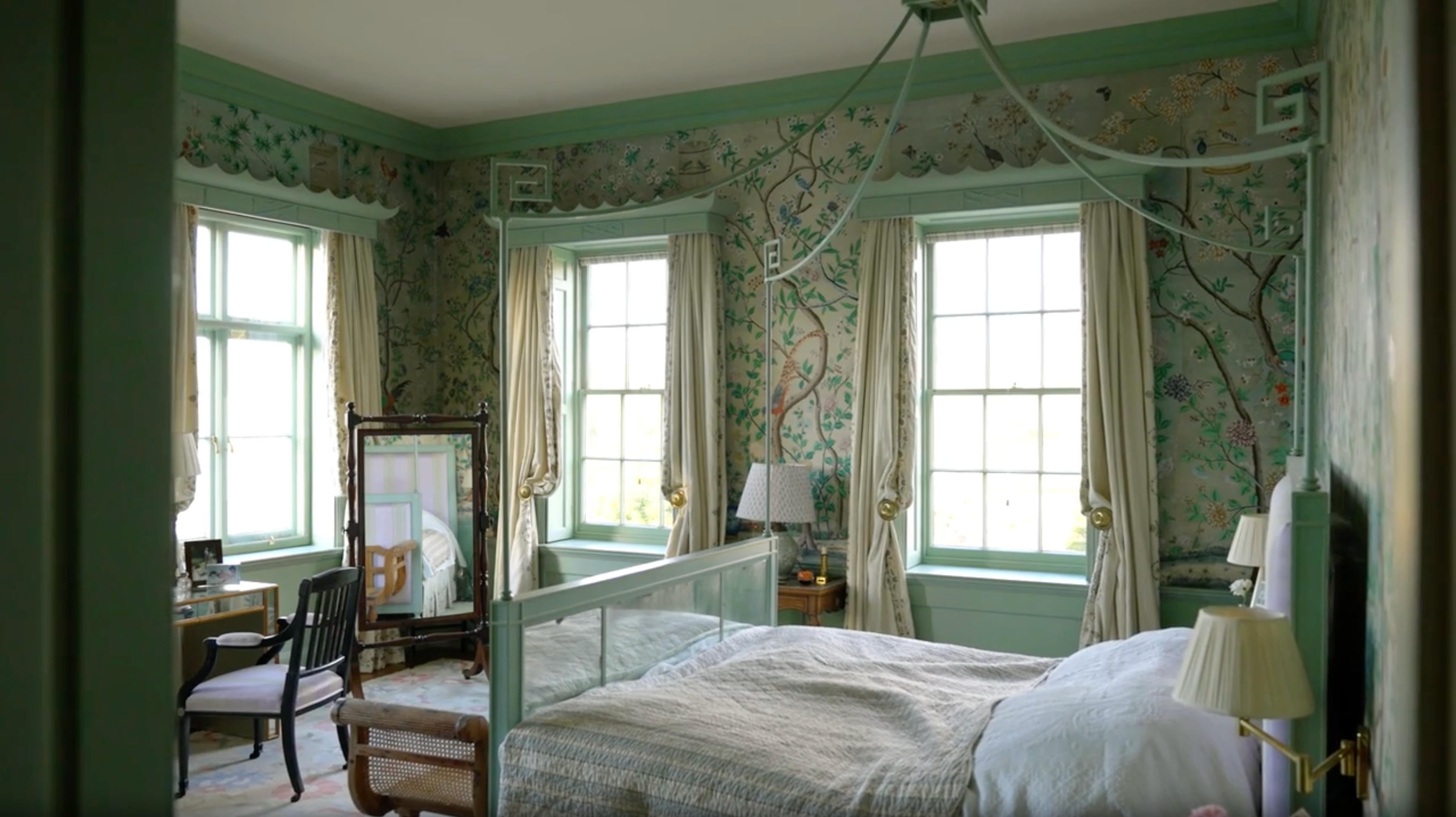
There are a few guiding principles to help you. First, consider the weight - if you use a deep colour on your walls but a bright white, this will create a stark and arguably uncomfortable contrast. Determine what weight of colour you are using in the rest of the scheme, and match this in your choice of offwhite.
Ask yourself what undertones you need to be prevalent in an off-white to create a complementary contrast with the other surrounding colours. This is quite a subtle observation as there isn't too much pigment in an off-white, but it will help the overall look to feel balanced.
If you're using an off-white on a trim of some kind, it may at some point hit a marble fireplace or stone floor, so it's worth also evaluating the tonality of other materials in the room.
Picture rails work to define a wall in a different way - instead of the height of the wall being defined by the skirting board and the cornice, a new line was created. Traditionally, wallpaper was often used between the skirting and the picture rail, and then cheaper paint applied above to the cornice.
If you have an older room where the picture rail has been installed more recently, I would be inclined to remove it if it no longer serves a purpose in the space. This will restore the original design intent of the room.
Alternatively, if you would prefer to leave the picture rail in place but want to smooth the transition, you can simply paint it in the same colour that you're using on the wall.
Finally, if you enjoy the way the picture rail plays with scale in the room, you can paint up to it in one colour and then have another colour between the picture rail and the cornice.
In the past, we've seen examples of doors being painted in deep colours. I would say you need a room of a certain scale or architectural grandeur to pull this off. If you do want to go for dark colours on the doors, I would adopt this same colour across all the joinery within the room to avoid it looking too mismatched.
Various things could act as your starting point, and these will depend on your scenario. It might be existing features, or it might be a colour you're set on using, or it may well be the element your builders are asking you to order first!
Whatever they are, there will always be some determinants and I think the best thing is to work with these.
Colour is important, but perhaps the most important and defining element to consider is how exactly you will occupy the room. When will you mostly use it, who will use it and what feeling do you want to evoke?
These factors are surprisingly helpful to evaluate when deciding on colour, as they help to drive and narrow down your choices based on practicality.
There has been a growing trend towards decorating with pink in interiors, and it is a fantastically useful colour. My advice would be to be wary of pinks that are 'too pink'. It may at first look too subtle on the colour chart, but in reality it will read much pinker with the effect of daylight. We offer two seemingly similar pinks, with one relying more heavily on yellow ochre and the other on red ochre. They are suited to different environments and can look very different when in situ.
Get the full workbook, video lessons, and more with a Create Academy subscription.
Subscribe to access the full workbookAlready a member? Sign in to watch
479 reviews
Read moreCreate Academy has been such a great resource. I'm in the middle of renovating a bungalow with a very large garden and the courses have offered a wealth of inform...
Harvey
Jun 10, 2026
Absolutely love Create Academy! The instructors are extremely informative, and it is beautifully filmed. Create Academy is great value for money and plan on renew...
SG
May 31, 2026
Butter's creativity is stunning! Her ability to incorporate brilliance in small gardens is magical!
Carla
May 30, 2026
The best adventure. I like all the courses, but my favorite are both Rita Konig interior design courses and Anna Jones. Excellent!
Karolina Kluczewska
May 20, 2026
Create Academy has been such a great resource. I'm in the middle of renovating a bungalow with a very large garden and the courses have offered a wealth of information to dive into and explore new ideas. I'm...
Harvey
Jun 10, 2026
Absolutely love Create Academy! The instructors are extremely informative, and it is beautifully filmed. Create Academy is great value for money and plan on renewing my subscription yearly because there are ...
SG
May 31, 2026
Butter's creativity is stunning! Her ability to incorporate brilliance in small gardens is magical!
Carla
May 30, 2026
Your Instructor
Award-winning interior designer, architectural historian, paint expert. House & Garden Top 100.
Edward Bulmer is one of the UK’s leading interior designers and architectural historians, specialising in the restoration and decoration of historic buildings. After studying History of Art at university, Edward trained under legendary designer David Mlinaric CBE, as well as working for Alec Cobbe, and Gervase Jackson-Stops OBE, who was architectural advisor to the National Trust. Alongside running his own paint company, Edward Bulmer Natural Paint, Edward has led a highly successful design team for over 30 years, working on some of England’s greatest country houses as well as a range of private and commercial projects including Goodwood, the Tower of London, Chequers and the Arts Club.

Access to all courses


