


Interior and exterior confidence
Create Academy has been such a great resource. I'm in the middle of renovating a bungalow with a very large garden and the courses have offered a wealth of inform...
Harvey
Jun 10, 2026
A Guide to Pigments, Paints & Palettes
with EDWARD BULMER — Award-winning interior designer, architectural historian, paint expert. House & Garden Top 100.
Lesson 14 of 24

Subscribe to watch
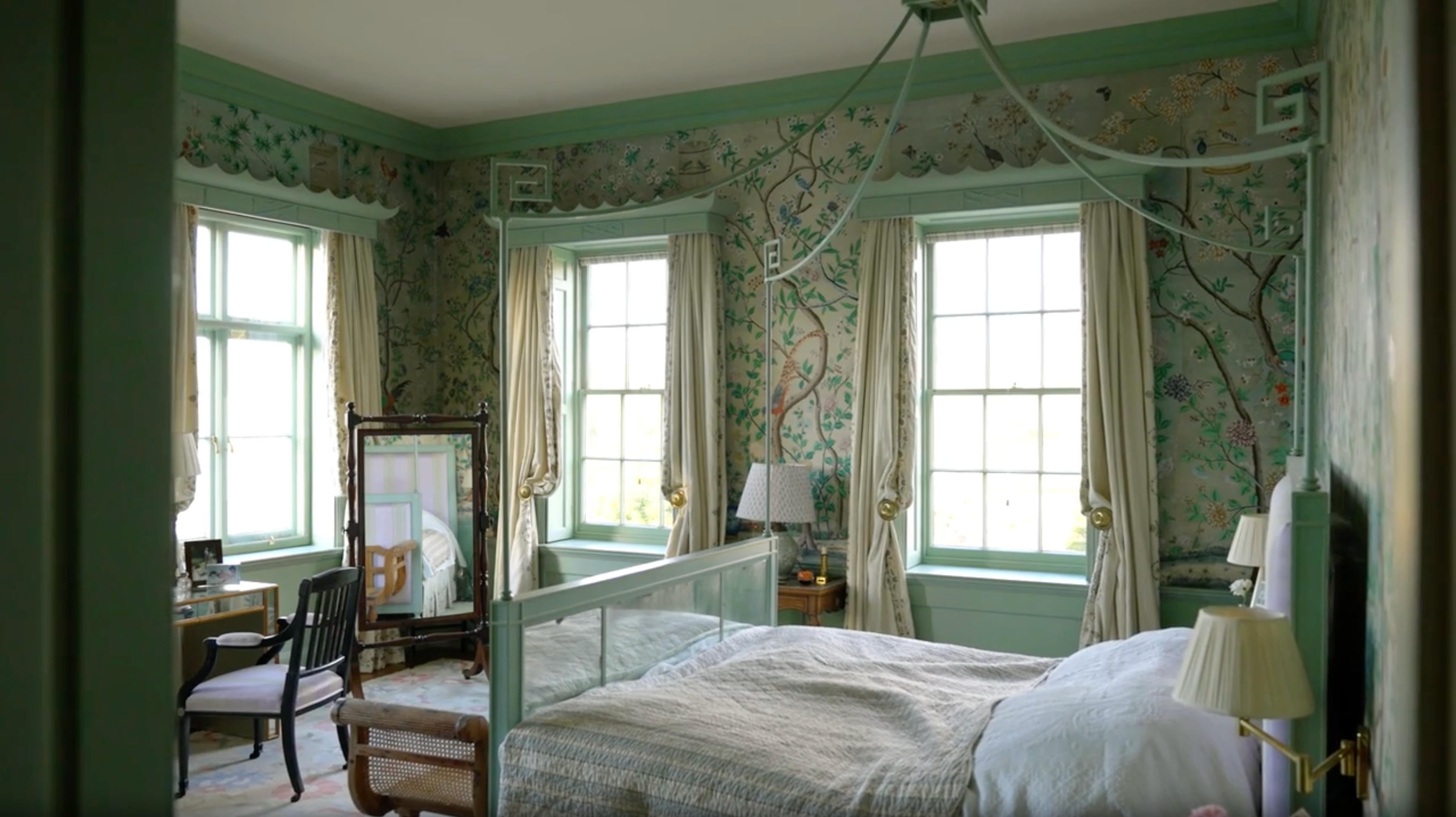
Dive deeper into tonality and weight as Edward explains how by balancing tonality - the shared pigments across different colours - you’ll be able to choose colours that balance perfectly together.
If you use a bright yellow colour, I would say the tonality is not going to be helpful within the rest of your decorating scheme.
However, if you introduce an underlying earth pigment, it will speak much more succinctly with the other elements and materials in your room and will feel a lot calmer.
Similarly, a bright green is quite strong and a challenging colour to decorate with. Instead, a deep earthy green that contains a touch of raw umber is much more grounding, will be easier on the eye and create a more comfortable room.
As well as practical considerations, there are other factors at play when decorating with colour.
While tonality is crucial, colour remains a choice. You may desire to paint your dining room red, in which case you would then explore the spectrum of reds to find the correct tonality.
Whether you pick out one room to decorate at a time, or attempt the whole house concurrently, it's helpful to consider colours in relation to each other. Assess the colours that already exist in the materials or furniture, and think of your paint colour will relate to those.
No matter how many colours you combine, it is the underlying tonality that will help the palette to feel harmonious and balanced.
Try to forget any preconceived notions you have of certain colours because, as we've discussed, adjusting the tonality can hugely impact the experience of it within a room. You may have previously disregarded pink, but it can actually be a beautifully earthy addition to a scheme and carries a historical prevalence too thanks to the wide availability of red ochre in the past.
Colour, of course, requires light and as a result, light has a huge impact on the way we experience and see colour. Natural light will fall in different places within a room at different times of the day, and this will impact the look of the paint colour. As well as natural light, artificial light will also adjust the appearance of colours.
To measure light, we use the Kelvin temperature chart. Daylight is around 6000 Kelvin, whereas a candle will offer around 1000 Kelvin. It is generally accepted that around 2800 Kelvin will show you the truest sense of the colour you have chosen.
No one room has a constant level or temperature of light, and so you will find that the appearance of colour will vary throughout the day - understood through the phenomenon of Metamerism.
While this is a fact of life, I have discovered that if you use a paint with just a single pigment, it's far more likely to change colour dramatically than if you make a colour with numerous pigments.
Ultimately, it's important to check your colour choices under the light that your room will most often be seen in to determine how the colour will appear in situ.
I recommend instead of painting a section of the wall, paint a piece of card instead so that you can move around to different areas where the light is stronger or weaker. I would also consider the colour next to furniture, fabric and wallpaper to see how it interacts with them too.
Using the framework of how I select colour, list all of the elements of your space that will feed into and impact your choice of colour. Then, over the page, you can then begin to think of the colour choices you might make as a result - as well as colour, consider the underlying tones you should include too.
Get the full workbook, video lessons, and more with a Create Academy subscription.
Subscribe to access the full workbookAlready a member? Sign in to watch
479 reviews
Read moreCreate Academy has been such a great resource. I'm in the middle of renovating a bungalow with a very large garden and the courses have offered a wealth of inform...
Harvey
Jun 10, 2026
Absolutely love Create Academy! The instructors are extremely informative, and it is beautifully filmed. Create Academy is great value for money and plan on renew...
SG
May 31, 2026
Butter's creativity is stunning! Her ability to incorporate brilliance in small gardens is magical!
Carla
May 30, 2026
The best adventure. I like all the courses, but my favorite are both Rita Konig interior design courses and Anna Jones. Excellent!
Karolina Kluczewska
May 20, 2026
Create Academy has been such a great resource. I'm in the middle of renovating a bungalow with a very large garden and the courses have offered a wealth of information to dive into and explore new ideas. I'm...
Harvey
Jun 10, 2026
Absolutely love Create Academy! The instructors are extremely informative, and it is beautifully filmed. Create Academy is great value for money and plan on renewing my subscription yearly because there are ...
SG
May 31, 2026
Butter's creativity is stunning! Her ability to incorporate brilliance in small gardens is magical!
Carla
May 30, 2026
Your Instructor
Award-winning interior designer, architectural historian, paint expert. House & Garden Top 100.
Edward Bulmer is one of the UK’s leading interior designers and architectural historians, specialising in the restoration and decoration of historic buildings. After studying History of Art at university, Edward trained under legendary designer David Mlinaric CBE, as well as working for Alec Cobbe, and Gervase Jackson-Stops OBE, who was architectural advisor to the National Trust. Alongside running his own paint company, Edward Bulmer Natural Paint, Edward has led a highly successful design team for over 30 years, working on some of England’s greatest country houses as well as a range of private and commercial projects including Goodwood, the Tower of London, Chequers and the Arts Club.

Access to all courses

