


Interior and exterior confidence
Create Academy has been such a great resource. I'm in the middle of renovating a bungalow with a very large garden and the courses have offered a wealth of inform...
Harvey
Jun 10, 2026
A Guide to Pigments, Paints & Palettes
with EDWARD BULMER — Award-winning interior designer, architectural historian, paint expert. House & Garden Top 100.
Lesson 12 of 24

Subscribe to watch
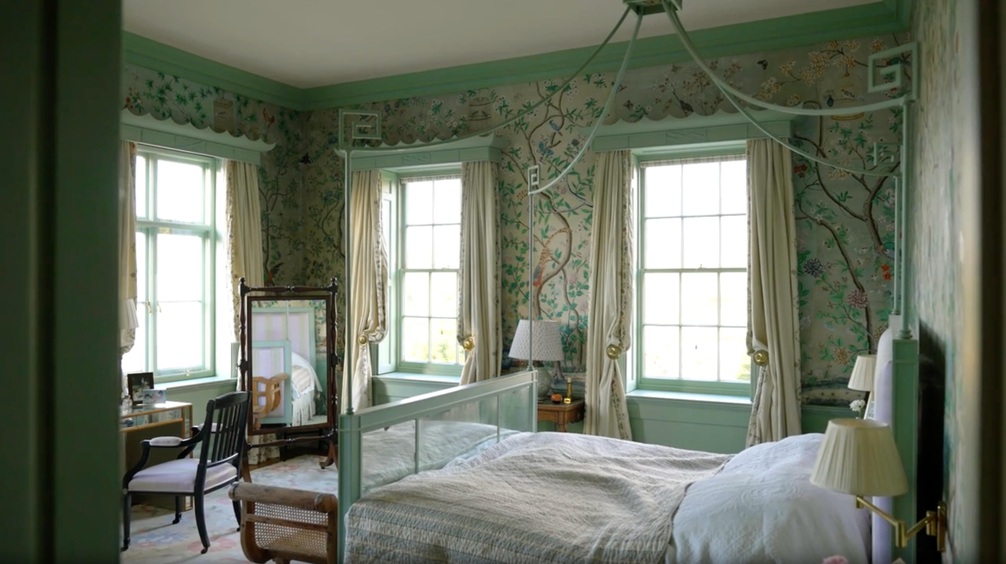
In this lesson, we learn how the colour wheel came into being and how we can use it to create successful decorating schemes.
As we have already learnt, it wasn't until the 17th Century that we began to understand the science behind colour, thanks to the work of Isaac Newton. As a means of explaining his colour theory, he invented the colour wheel to visually represent the colours he had discovered. This has been interpreted by many different artists ever since. It is a simple diagram that comprises of:
The colour wheel will be a great friend to you when you're planning your schemes and will help you combine colours successfully.
Using the colour wheel, experiment with creating complementary schemes and explore the variations available in terms of tonality, weight and temperature.
Moses Harris' Prismatic colour wheel
Learn about Professor Munsell's colour system
Get the full workbook, video lessons, and more with a Create Academy subscription.
Subscribe to access the full workbookAlready a member? Sign in to watch
479 reviews
Read moreCreate Academy has been such a great resource. I'm in the middle of renovating a bungalow with a very large garden and the courses have offered a wealth of inform...
Harvey
Jun 10, 2026
Absolutely love Create Academy! The instructors are extremely informative, and it is beautifully filmed. Create Academy is great value for money and plan on renew...
SG
May 31, 2026
Butter's creativity is stunning! Her ability to incorporate brilliance in small gardens is magical!
Carla
May 30, 2026
The best adventure. I like all the courses, but my favorite are both Rita Konig interior design courses and Anna Jones. Excellent!
Karolina Kluczewska
May 20, 2026
Create Academy has been such a great resource. I'm in the middle of renovating a bungalow with a very large garden and the courses have offered a wealth of information to dive into and explore new ideas. I'm...
Harvey
Jun 10, 2026
Absolutely love Create Academy! The instructors are extremely informative, and it is beautifully filmed. Create Academy is great value for money and plan on renewing my subscription yearly because there are ...
SG
May 31, 2026
Butter's creativity is stunning! Her ability to incorporate brilliance in small gardens is magical!
Carla
May 30, 2026
Your Instructor
Award-winning interior designer, architectural historian, paint expert. House & Garden Top 100.
Edward Bulmer is one of the UK’s leading interior designers and architectural historians, specialising in the restoration and decoration of historic buildings. After studying History of Art at university, Edward trained under legendary designer David Mlinaric CBE, as well as working for Alec Cobbe, and Gervase Jackson-Stops OBE, who was architectural advisor to the National Trust. Alongside running his own paint company, Edward Bulmer Natural Paint, Edward has led a highly successful design team for over 30 years, working on some of England’s greatest country houses as well as a range of private and commercial projects including Goodwood, the Tower of London, Chequers and the Arts Club.

Access to all courses


