Creating a colour palette
with TESS NEWALL
Lesson 17 of 32


Already a member? Sign in
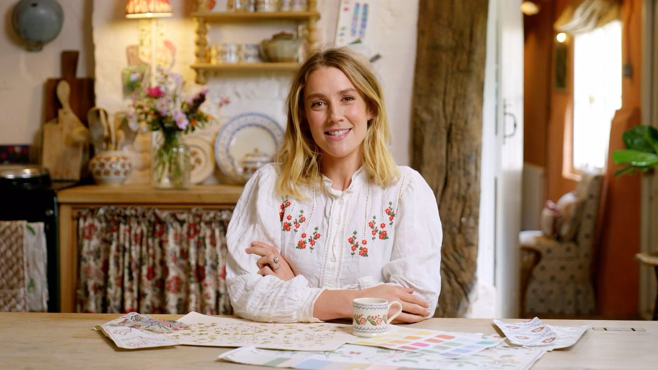
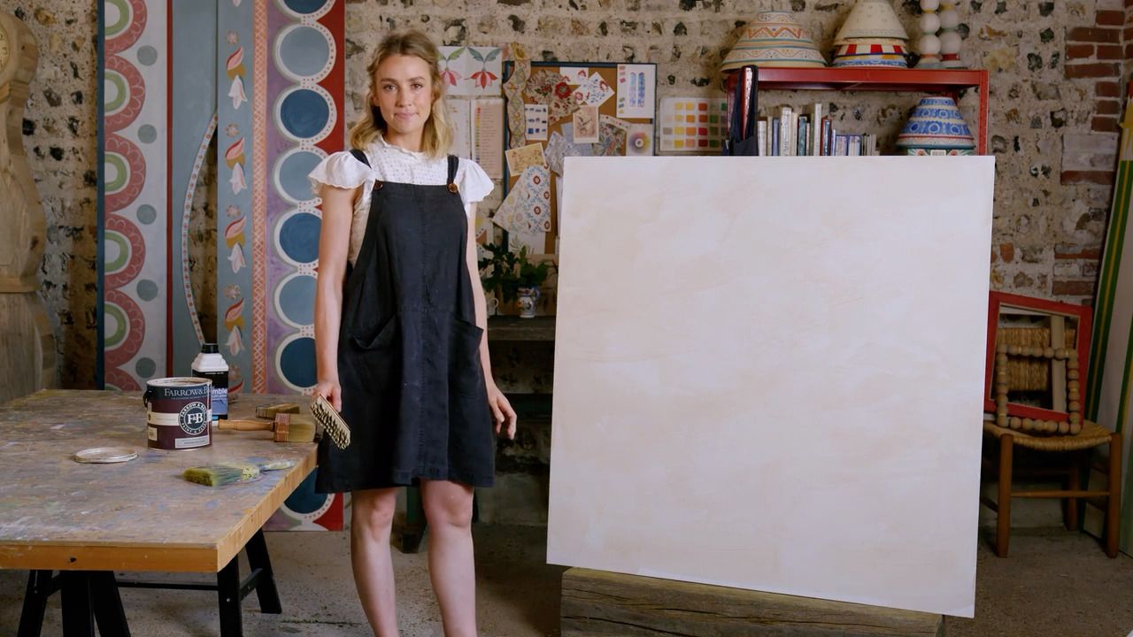
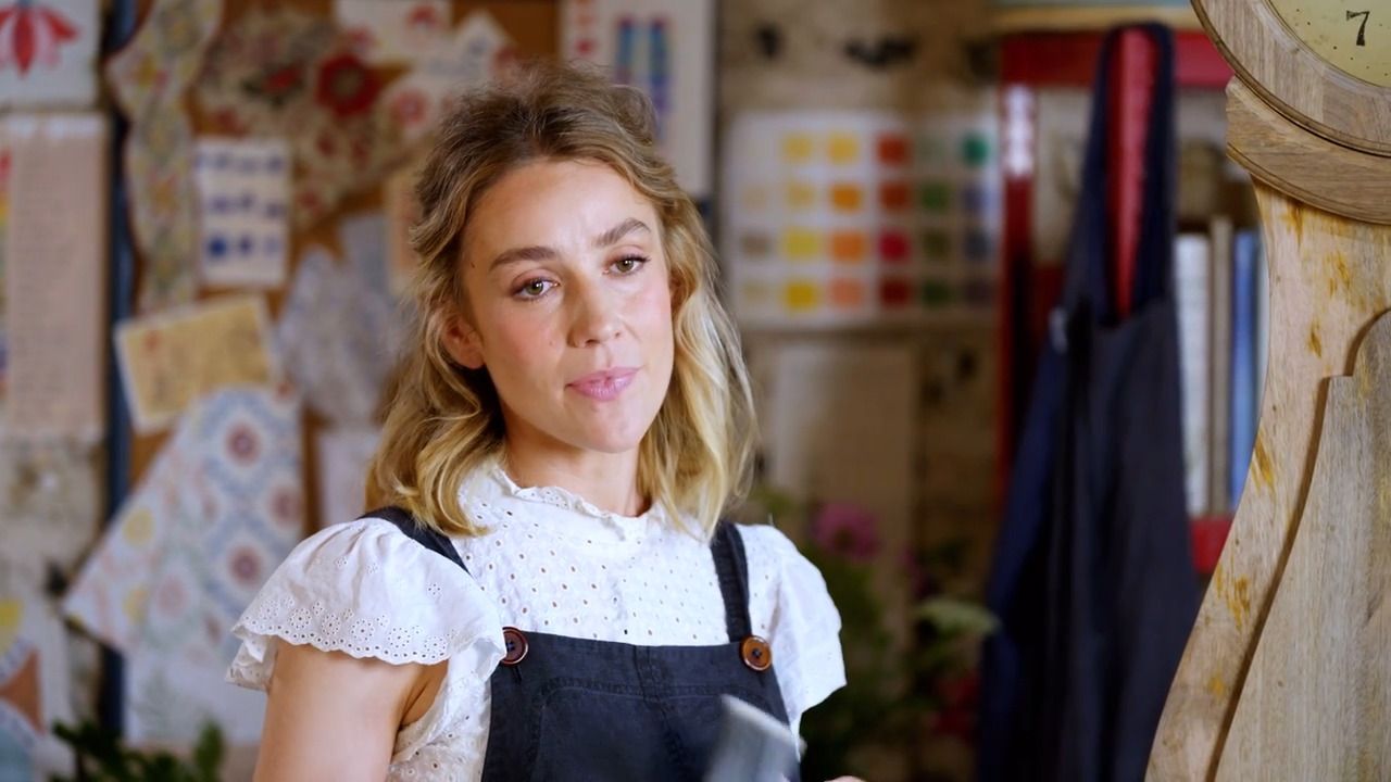
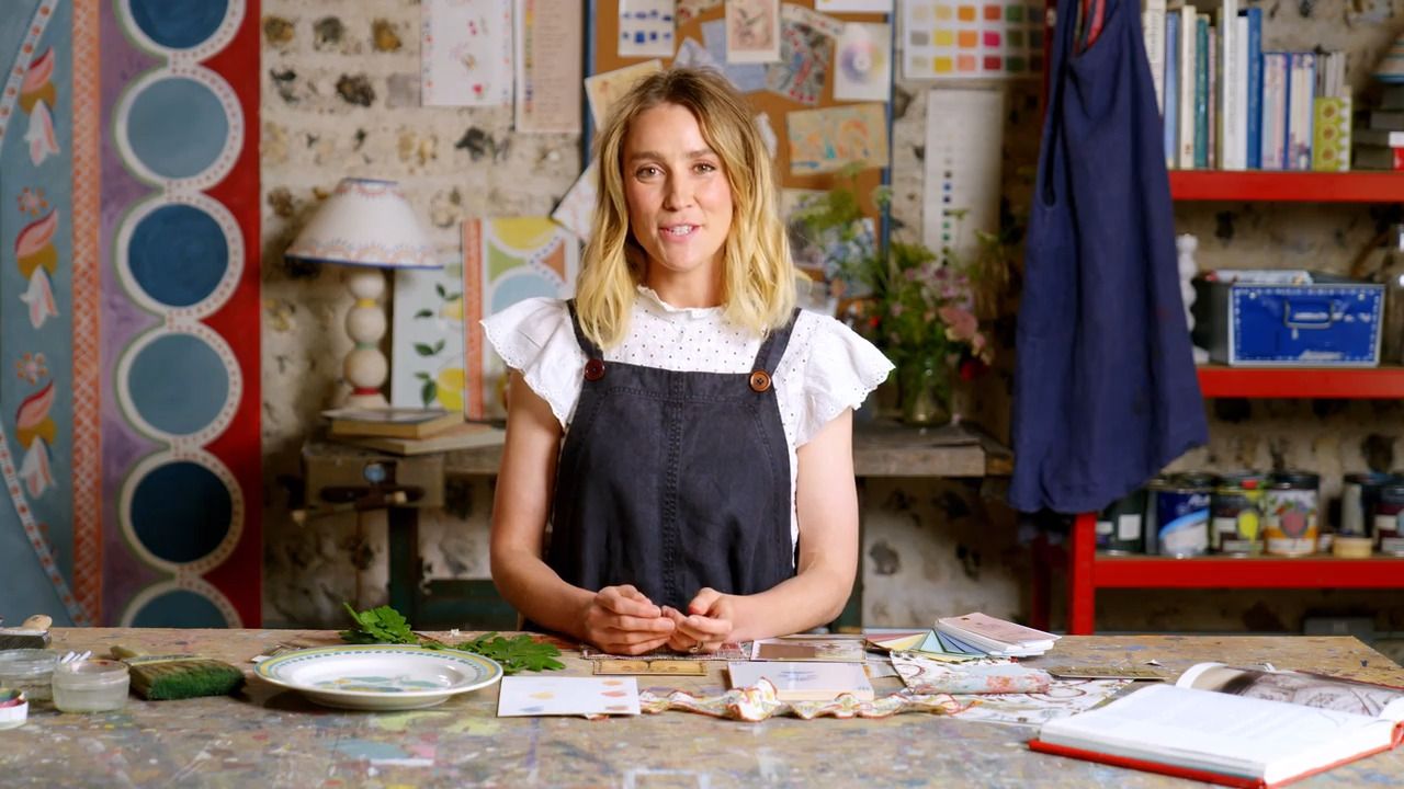
Colour is a hugely important part of decorative painting, but creating a palette of cohesive colours can feel daunting. In this lesson, Tess shows you where to start, and how to build up a range of colours that work well together. She encourages you to find the confidence to seek out the colours that stir joy within you, as well as showing you how to use them in your schemes
From the Lesson Workbook
Creating a Colour Palette
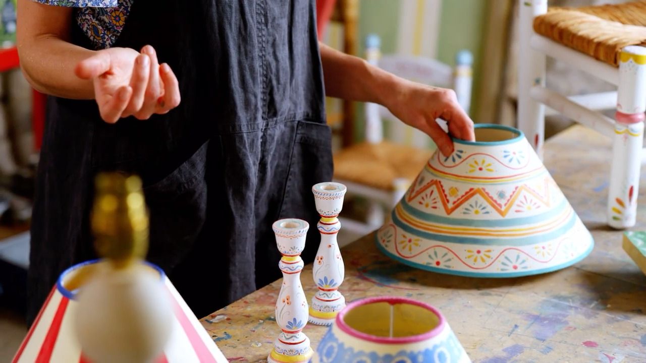
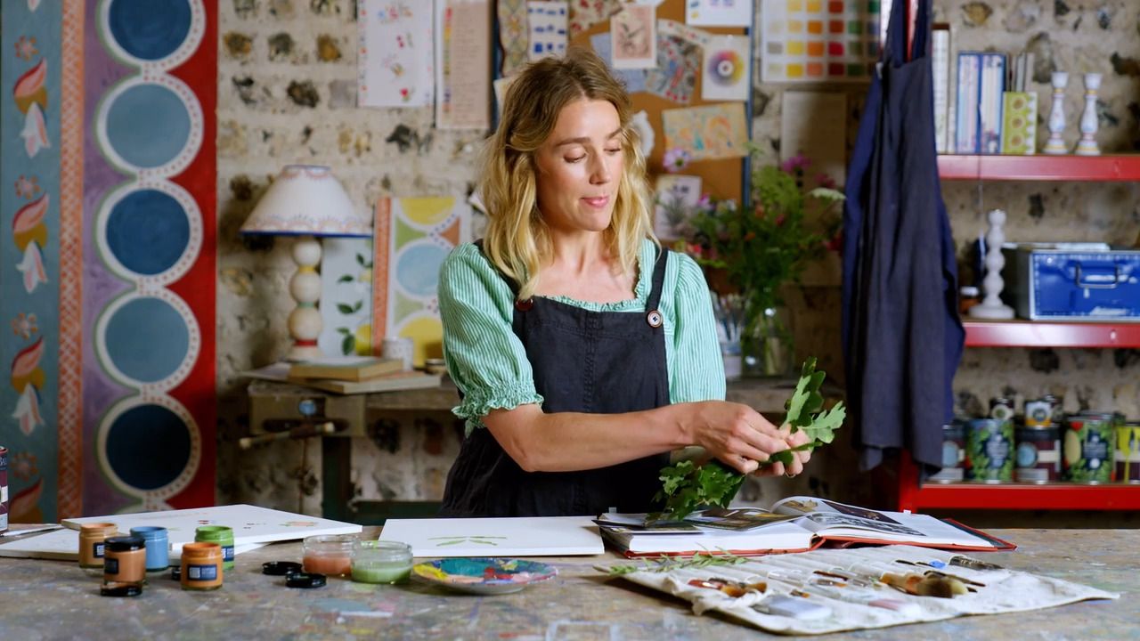
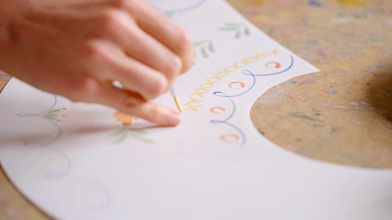
Colour is a hugely important part of decorative painting - not only because of its impact on how a room looks, but also how different colours make you feel too. I hope I can give you the confidence to seek out the colours that stir joy within you and show you how to use them in your schemes.
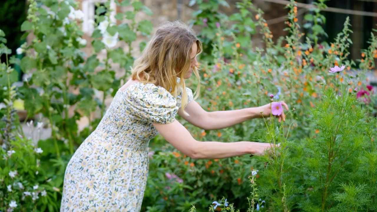
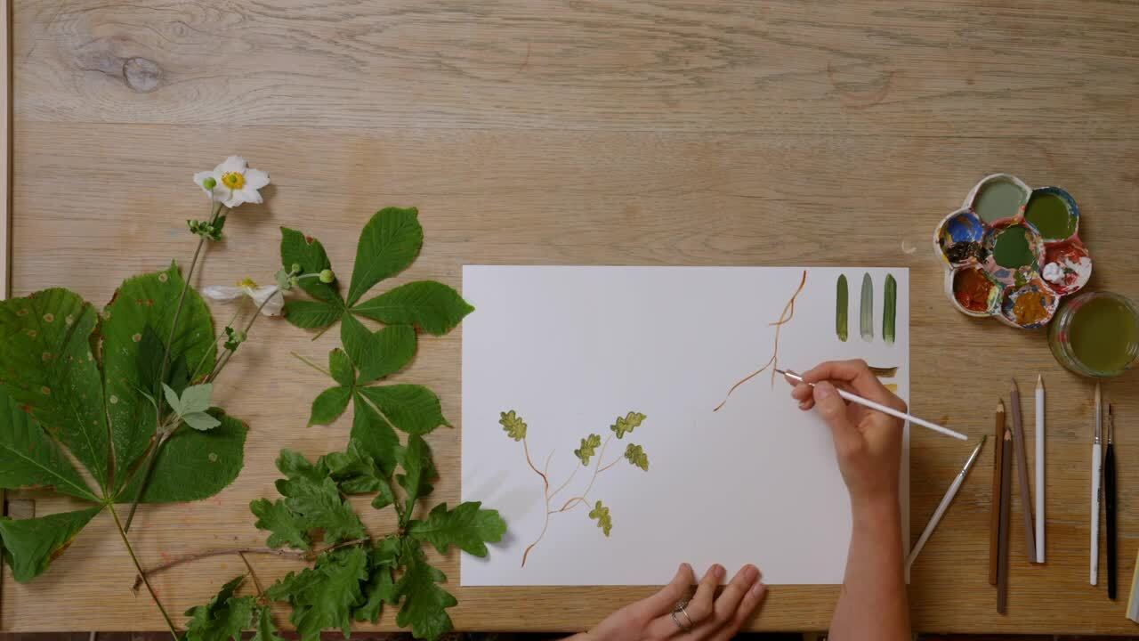
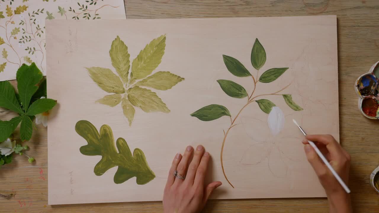
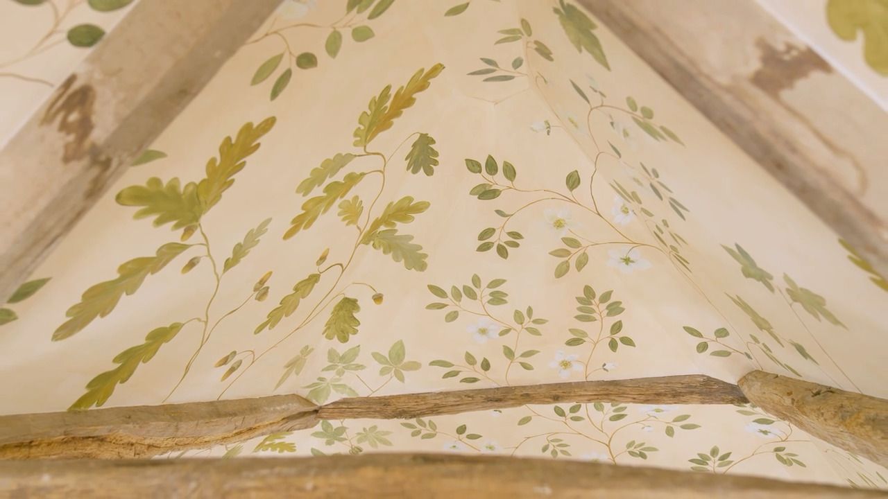
Looking to Nature for Colour Inspiration
Nature is full of so many moments of inspiration; for example, a patch of flowers in a garden can be a lovely place to observe different colour combinations.
Establishing a Colour Palette
Step 1
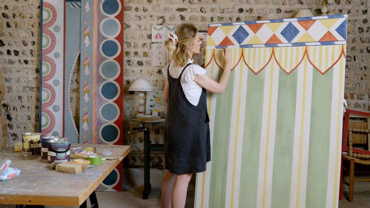
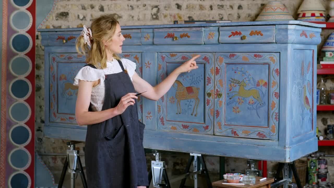
When starting any project, it helps to choose a hero colour as a starting point. This could be taken from other colours that exist within the room already, even if it is in small doses.
Step 2
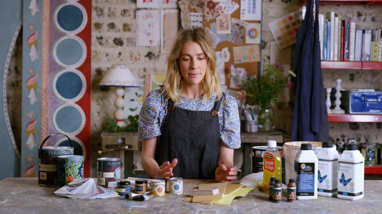
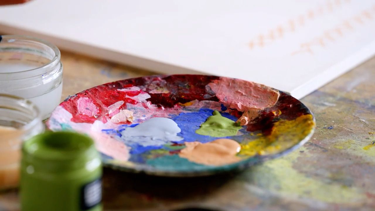
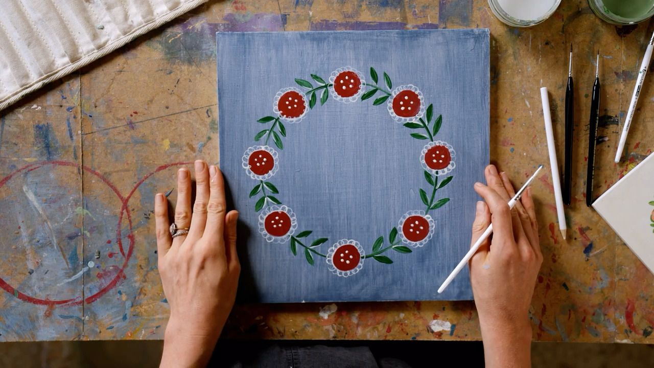
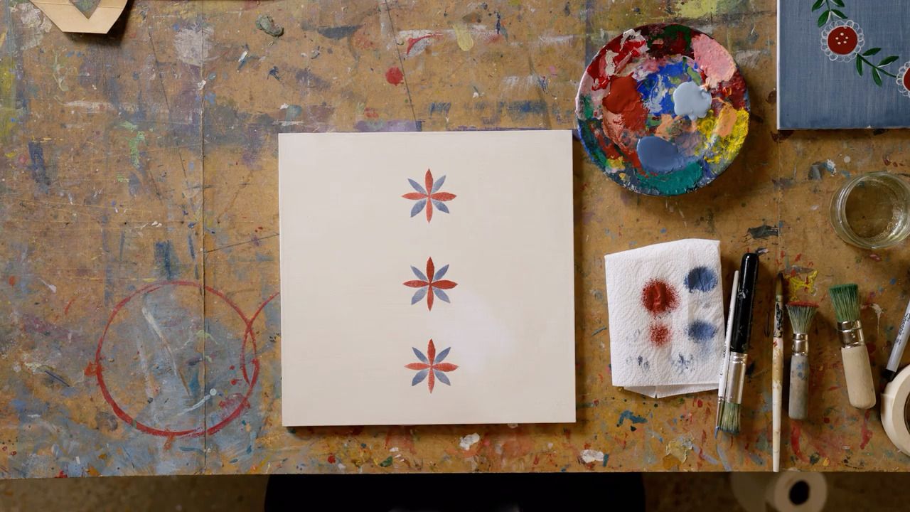
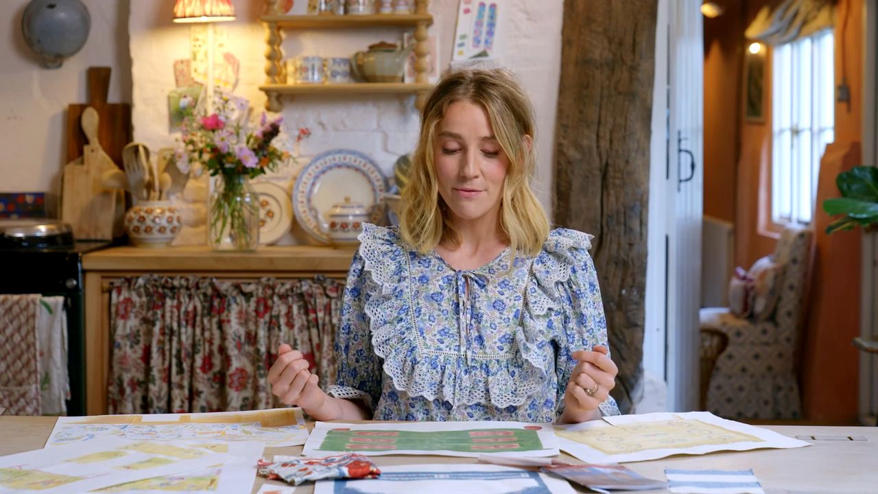
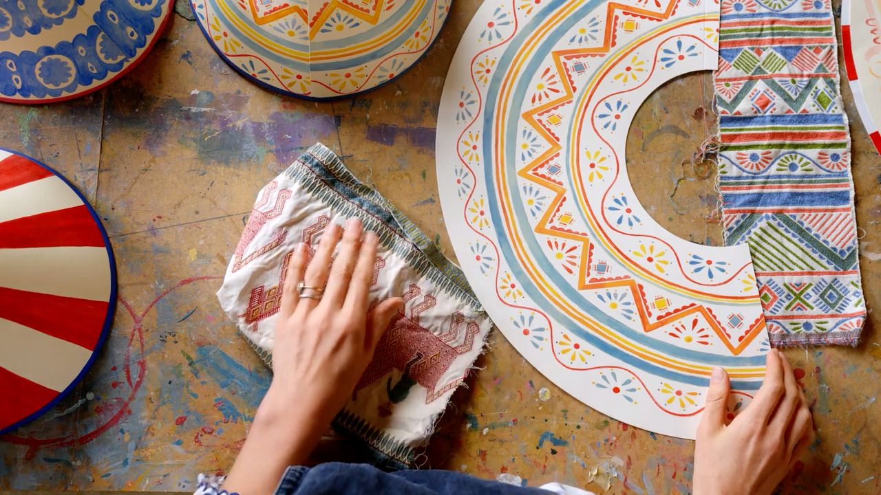
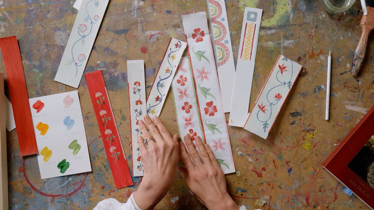
Once you've decided on your hero colour, it's time to start creating your extended palette. At this point, I try to gather as many physical swatches as I can, so I can begin to work out which colours sit nicely together. Trust your instinct and follow your personal preference.
Step 3
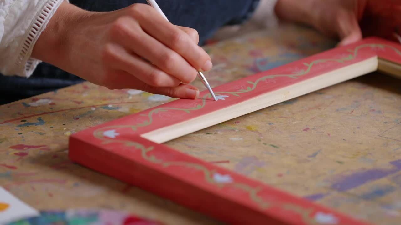
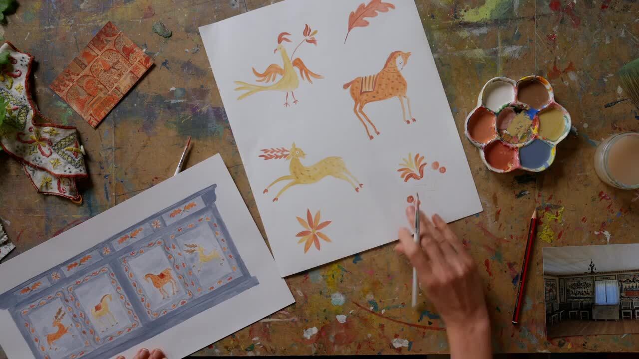
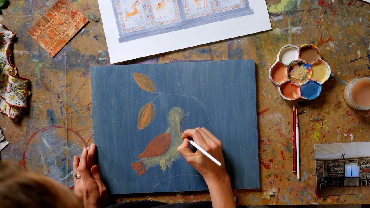
As you establish combinations, start to explore slightly different tones and shades within the colours you're choosing - it's amazing how even a subtle variation can suddenly make the palette feel perfect.
Tips for Building a Colour Palette
- Sometimes widths of fabric will have swatches of the colours used within the pattern printed along the edge, which can be helpful if you're building a wider scheme based on a colour within the fabric.
- Think about the base of a colour; I tend to prefer shades with an earthier base - and if colours have a similar base, they will work nicely together.
- I would always recommend opting for a warm white as opposed to brilliant white. It feels more comfortable within a room and creates less contrast with other colours.
- Invest in the larger paint sample fans, as they give a much better impression of the colour than the same swatch in the paint cards.
- When finalising your colour choice, it's a good idea to buy the small sample pots so you can test it out in situ and check how the light in your room impacts how the colour reads.
Knowing the Basics of the Colour Wheel
The primary colours are red, yellow and blue.
Secondary colours are created by mixing the primary colours; these are green, orange and purple.
Colours that sit opposite each other on the colour wheel are considered to be complementary combinations.
Get the full workbook, video lessons, and more with a Create Academy subscription.
Subscribe to access the full workbook
Your Instructor
Tess Newall
Acclaimed artist and set designer specialising in hand painted homewares and decorative painting.
Tess Newall is a decorative artist based in Sussex, specialising in hand-painted bespoke murals and furniture. Following a decade of experience as a set designer and painter in the film industry, Tess has mastered how to bring a creative vision to life. She often draws on historic patterns and aims to capture an artisanal feel, where textures and brushstrokes add to the atmosphere of a room or to the character of a furniture piece. Tess and her studio team work with interior designers and private clients on bespoke commissions for both commercial and residential projects, as well as collaborating on homewares collections with brands including Liberty and Matilda Goad.

.jpg)


Access to all courses